El Cerrito
visual identity and collateral design
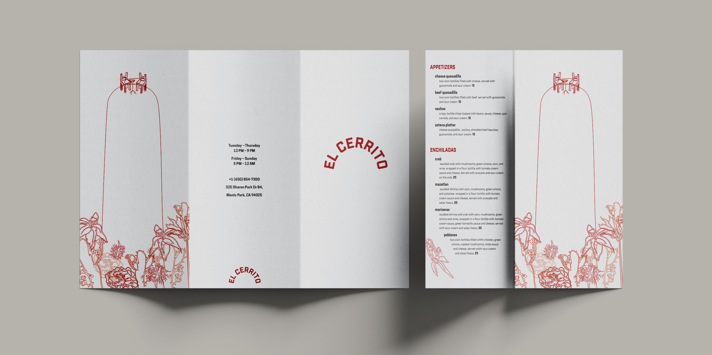
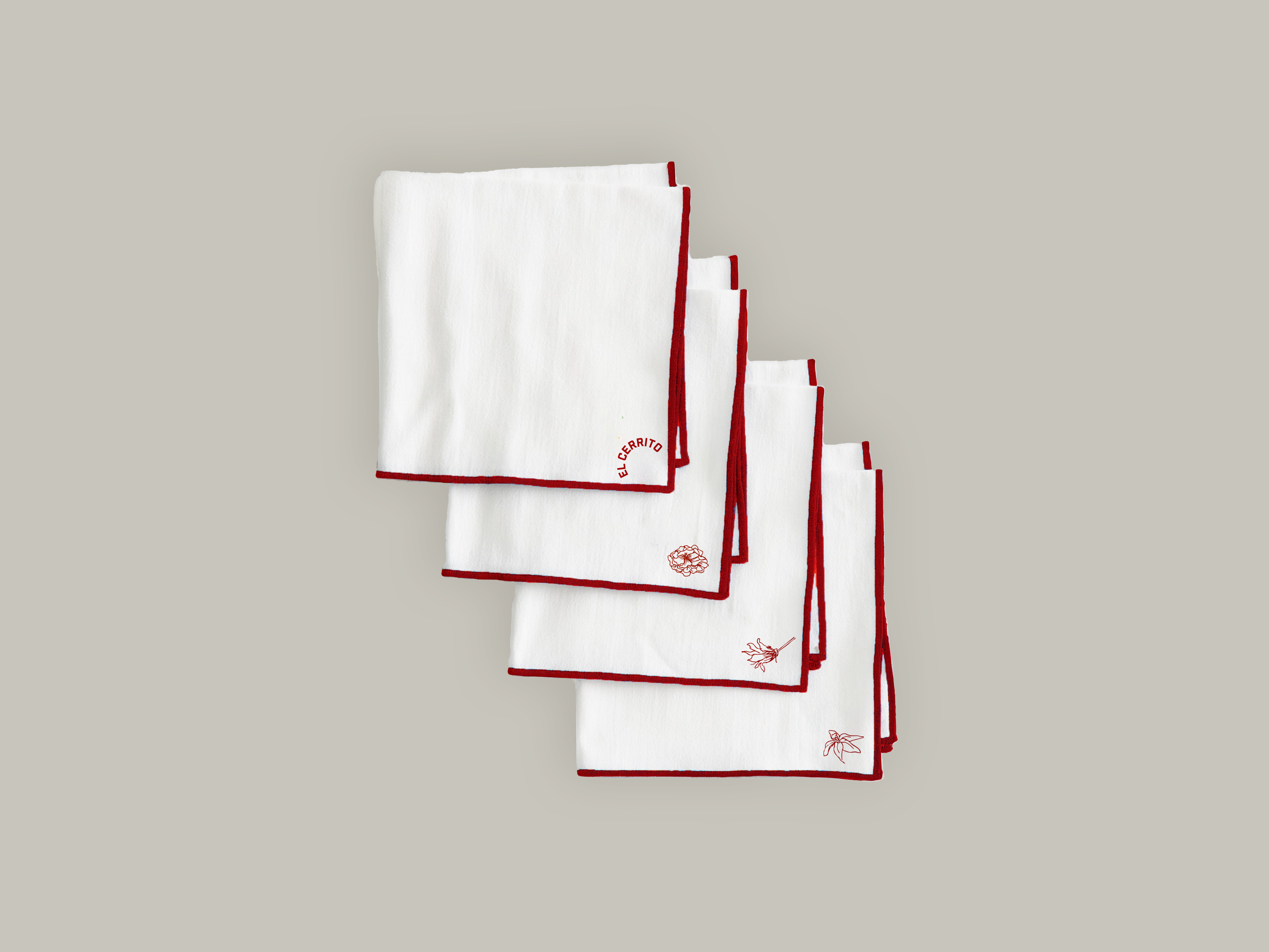
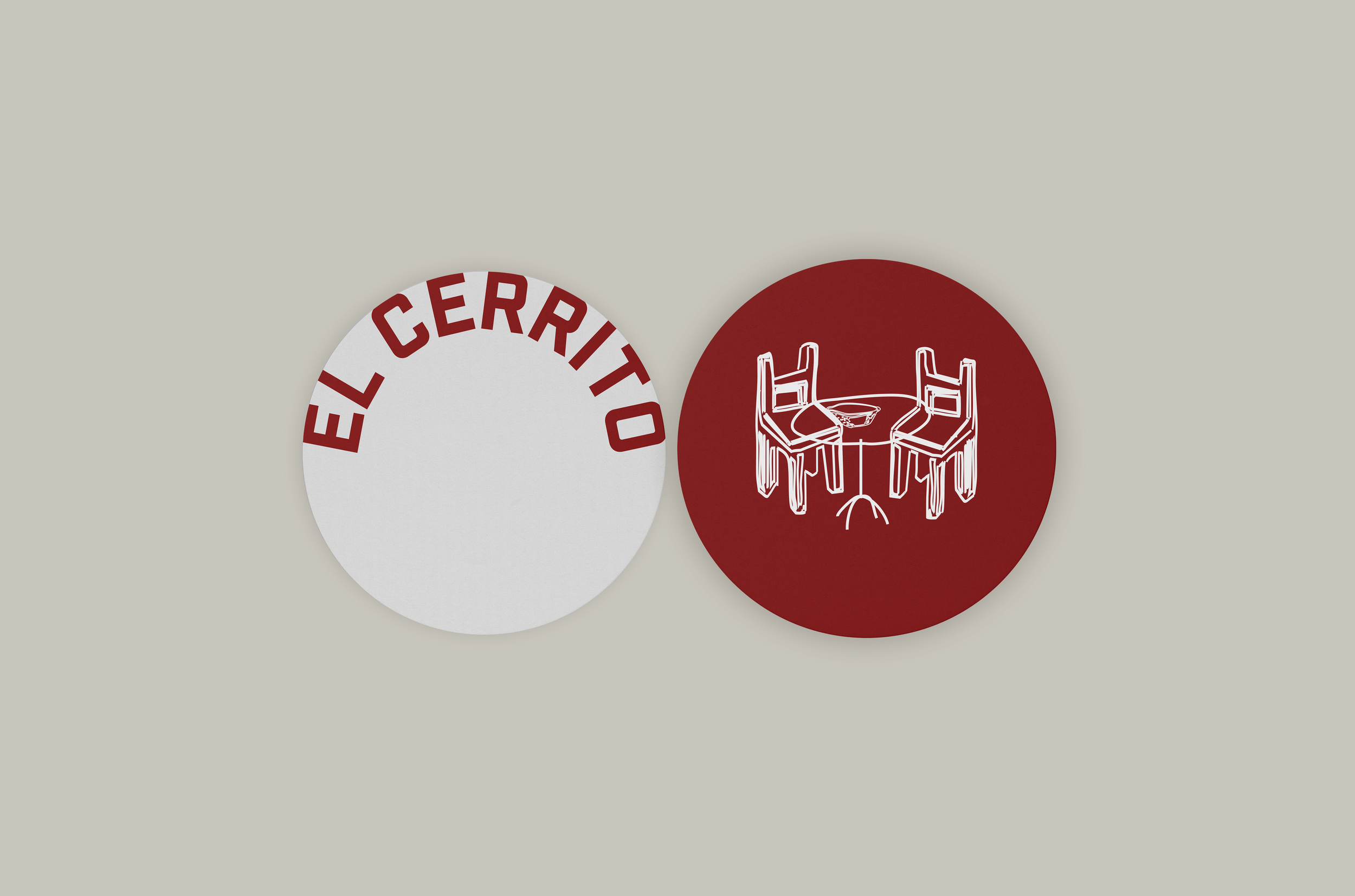
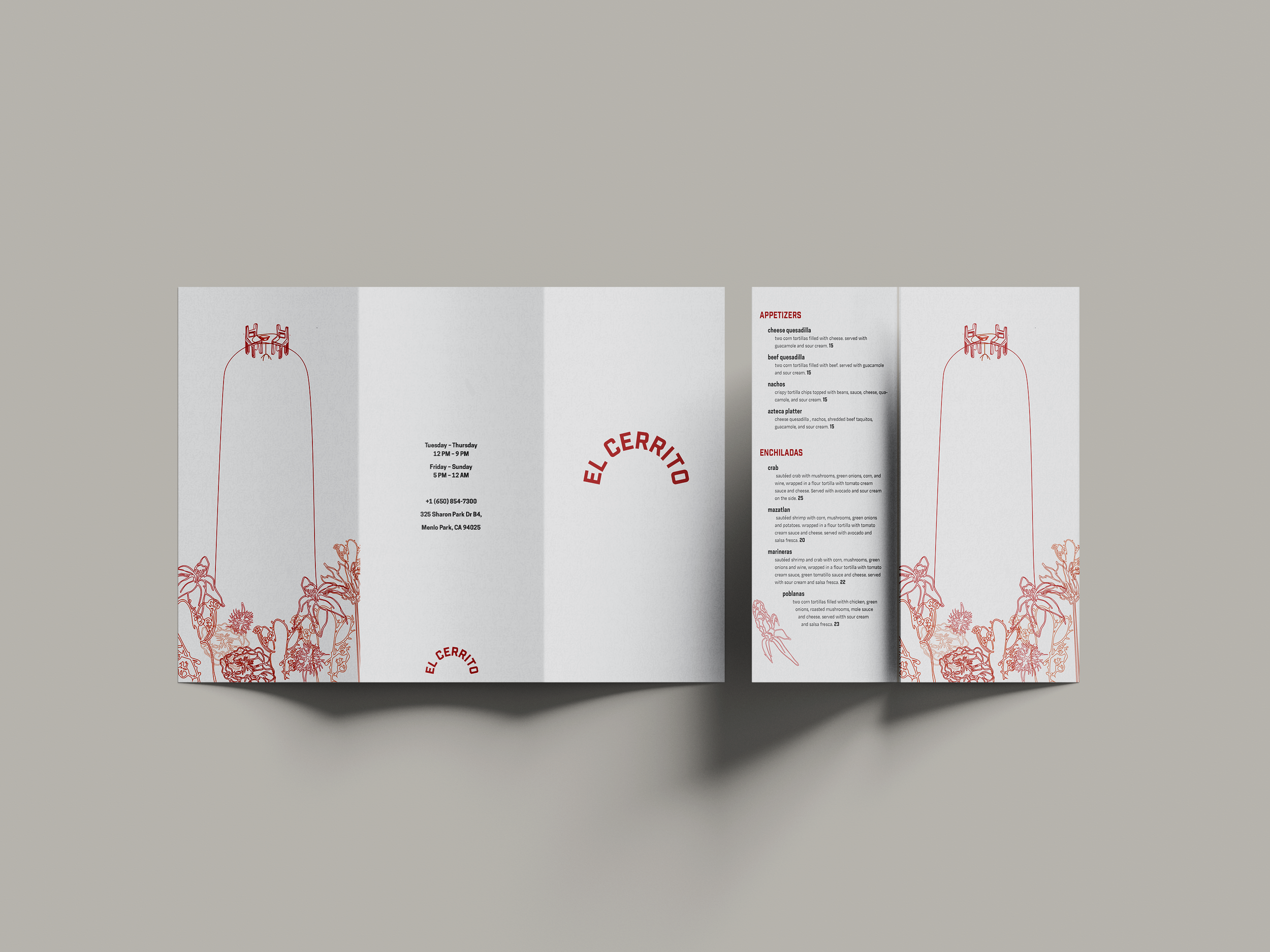
This is a rebrand for a Mexican restaurant called El Cerrito. For this project, I created a visual identity, a menu, and other branded collateral for the business. The designs have an intimate and casual visual language, keeping a personal relationship with their customers while providing an elevated experience.
Designing the brand
The logo is a curved type-based logo, spelling out the name of the restaurant, which translates to “the little hill”.
Color-wise, the dark red plays into Mexican associations, while keeping an elegance and not being too on the nose.
For the logo, titles, and headers, a boxy, bold sans serif that demands attention, without being harsh or very decorative. The subheading and body copy typeface is another sans-serif font that is a bit more curved and traditional.
Throughout the branded designs, especially in the menu, there is a focus on handcrafting, keeping the visual language intimate and personal for the restaurant’s customers. The type design replicates a typewriter, and the illustrations are exaggerated sketches that celebrate Mexican food culture, as if someone sketched it out on a napkin.