NACA
visual identity and trifold die-cut brochure
For this project, I created a visual identity for a conceptual organization that celebrates and bridges American and Nordic cultures. The project also included an illustration-based die-cut brochure that educate the reader about the Swedish summer solstice celebration of Midsummer.
Identity Design & Visual System
I developed a complete visual identity rooted in cultural research. The design is grounded in Kurbits—a narrative Swedish folk art tradition—translated into a modern visual language. This wasn't about creating a museum piece; it was about building a cohesive identity that brings cultural heritage into contemporary context.
The logo serves as the visual anchor: Odin's eye, representing the Norse god who sacrificed for knowledge. This symbol positions NACA as both a guardian of tradition and a source of cultural wisdom, creating a distinctive mark with deep cultural resonance.

brochure Development
-
Typography
I selected Bagnard for headers—a stylized sans-serif with subtle traditional qualities—paired with Vollkorn for body text. This combination creates flexible hierarchy while bridging traditional and modern sensibilities, maintaining both warmth and professionalism across applications.
-
Color Palette
The color palette evokes the luminous quality of Swedish summer: soft, airy colors that reference the midnight sun near the Arctic Circle. By avoiding harsh blacks and whites in favor of cream and muted blues, the palette maintains approachability while feeling distinctive. The transparent, vital accent colors connect to the fertility and growth central to Nordic summer celebrations.
-
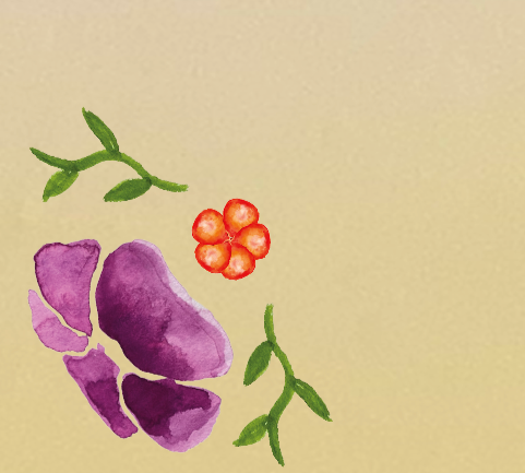
Illustration Style
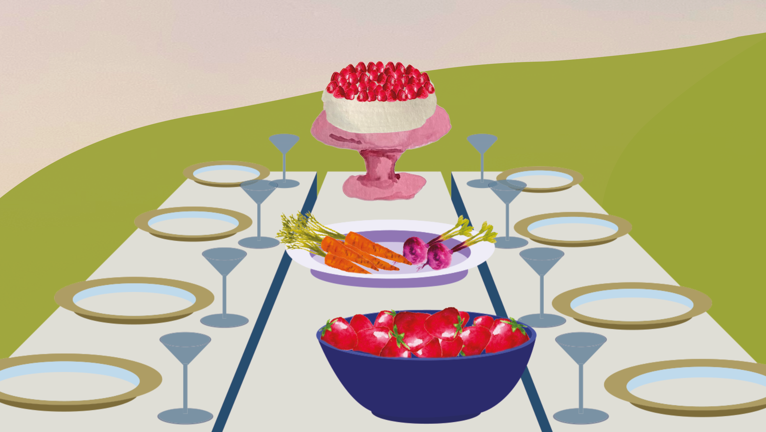
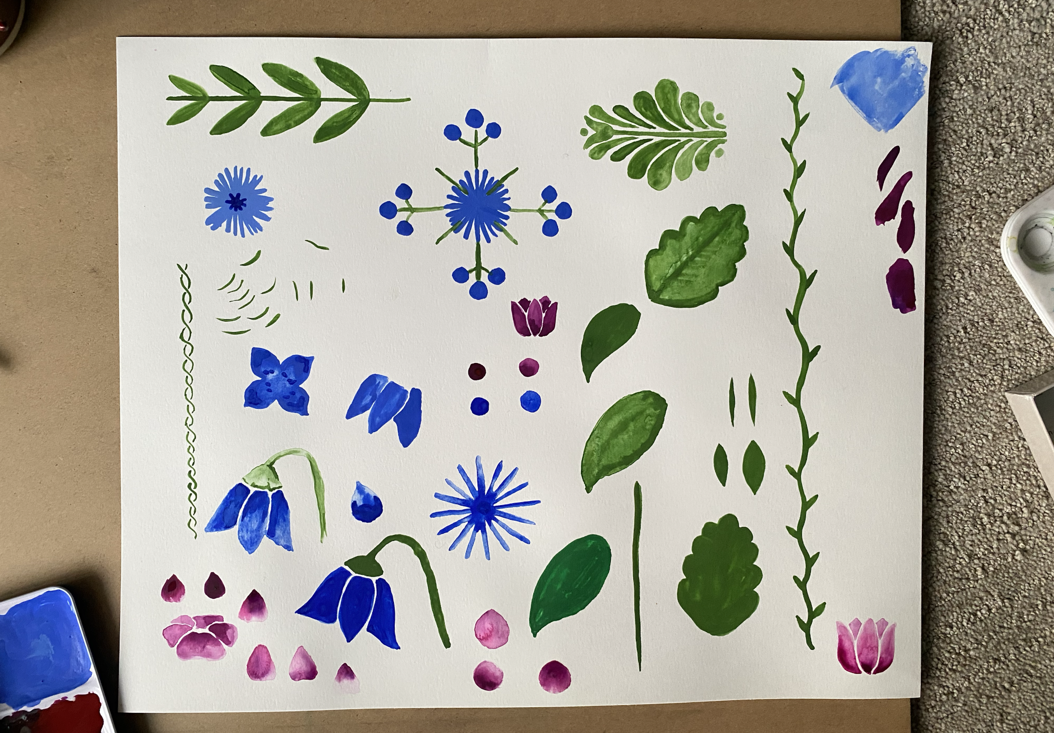
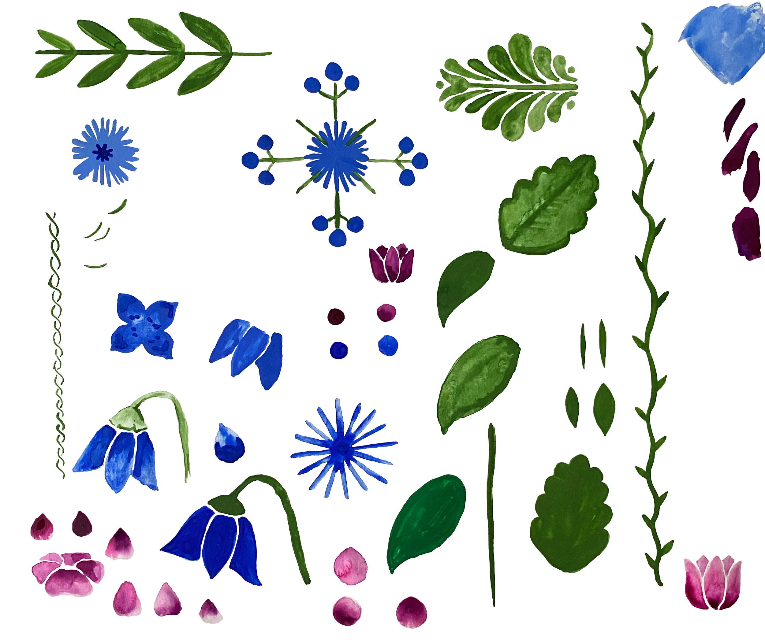
I developed a custom illustration approach based on traditional Kurbits painting, creating a signature visual aesthetic. Every element is hand-painted, then refined digitally—establishing a cohesive look that differentiates NACA while maintaining cultural authenticity.
Brochure Design & Application
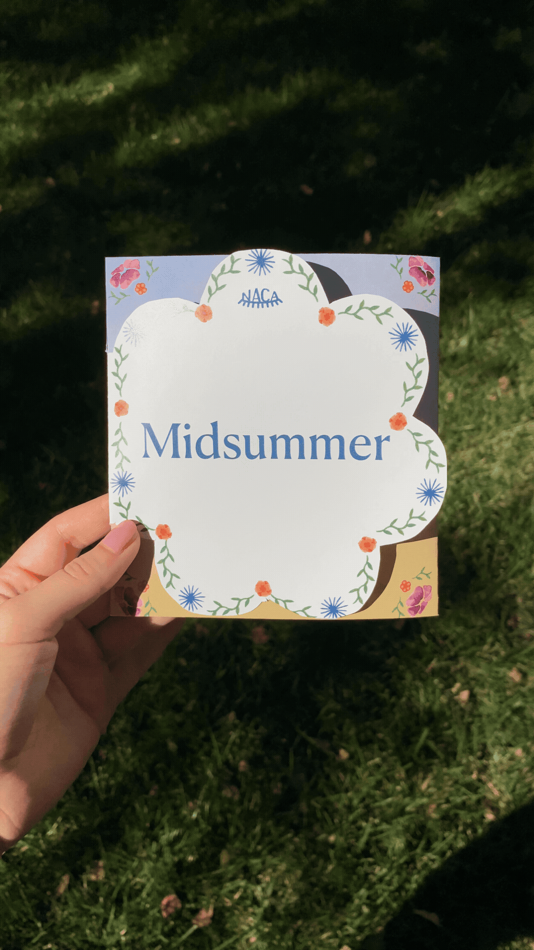
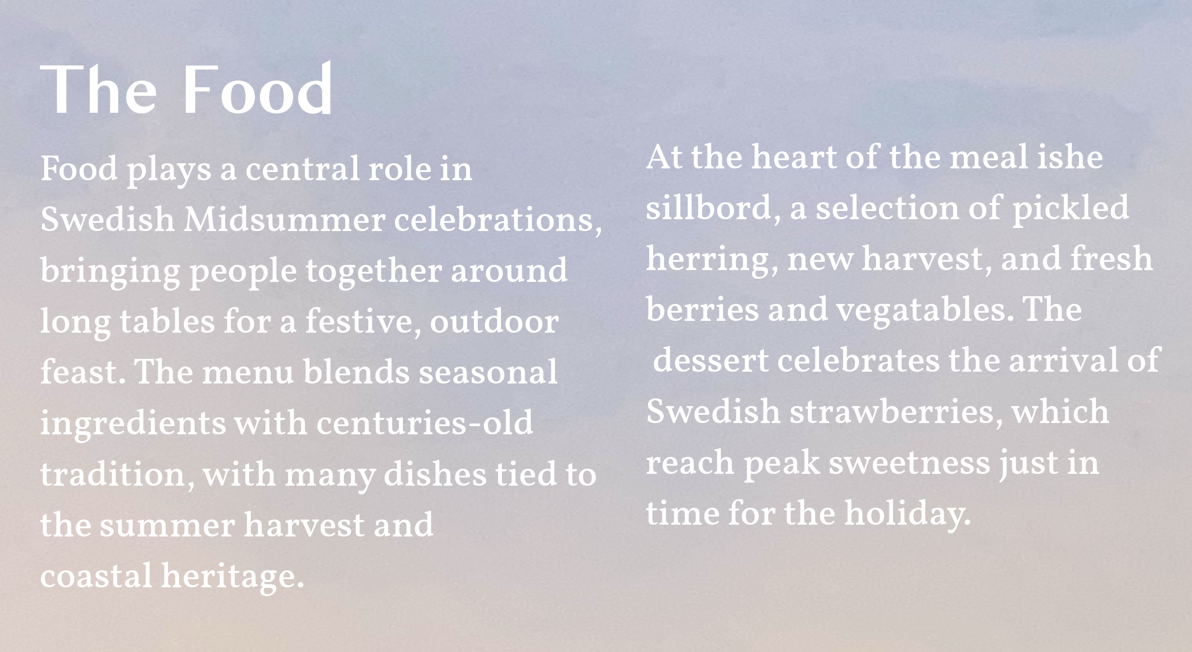
The tri-fold educational brochure introduces the Swedish Midsummer celebration while demonstrating how the visual identity works in application. The die-cut cover element creates memorable tactile impact and references traditional flower crowns, while hand-painted Midsummer scenes show the narrative potential of the illustration style. Generous negative space and an illustrated book aesthetic ensure visual elements enhance rather than overwhelm educational content, and the typography system proves its versatility across the informational hierarchy.
Design Thinking
The NACA identity demonstrates how deep cultural research informs cohesive visual design. By studying traditional Swedish folk art and understanding the cultural significance of Midsummer, I created a visual system that honors heritage while feeling relevant to contemporary audiences. The cohesive storytelling approach and balance between decoration and readability proved effective in engaging viewers with unfamiliar cultural content.