Aftonglans
Aftonglans is a painter based in Lund, Sweden. Before this project, the name was an Instagram account where he shared his paintings anonymously, trying to build a digital presence among like-minded artists and art collectors. The brand vibe was very much "take a photo whenever you think of it"-not very thought through nor coherent. The task was to create a more confident digital and physical presence that felt good to share with people he met.
Discovery: Understanding the Problem
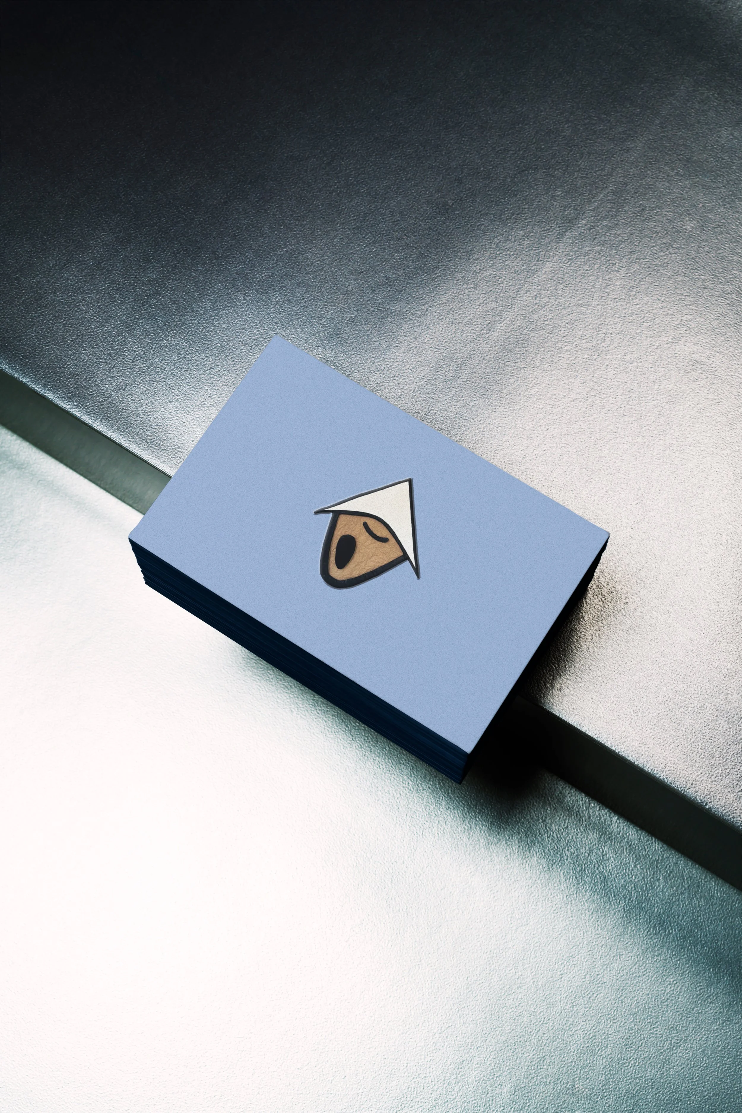
Aftonglans did not have a brand to start with. It had a brandmark: a close-up of a painting with an abstract face. This figure became recognizable, though it didn't inherently define the brand beyond being a work by the artist. At the time, he mostly wanted to connect with other artists, but he also wanted to slowly move toward selling his art or having it displayed in galleries.
The client wanted to position himself as an artist, not a content creator. He listed inspirations such as Keith Haring, Jean-Michel Basquiat, and contemporary digital artists. The recurring theme was the grittiness and urban influences, especially the underground art scene in 90s New York. However, for the brand itself, he wanted it to feel looser and lighter. It should feel softer and more modern, to contrast with the art he creates.
Designing Aftonglans
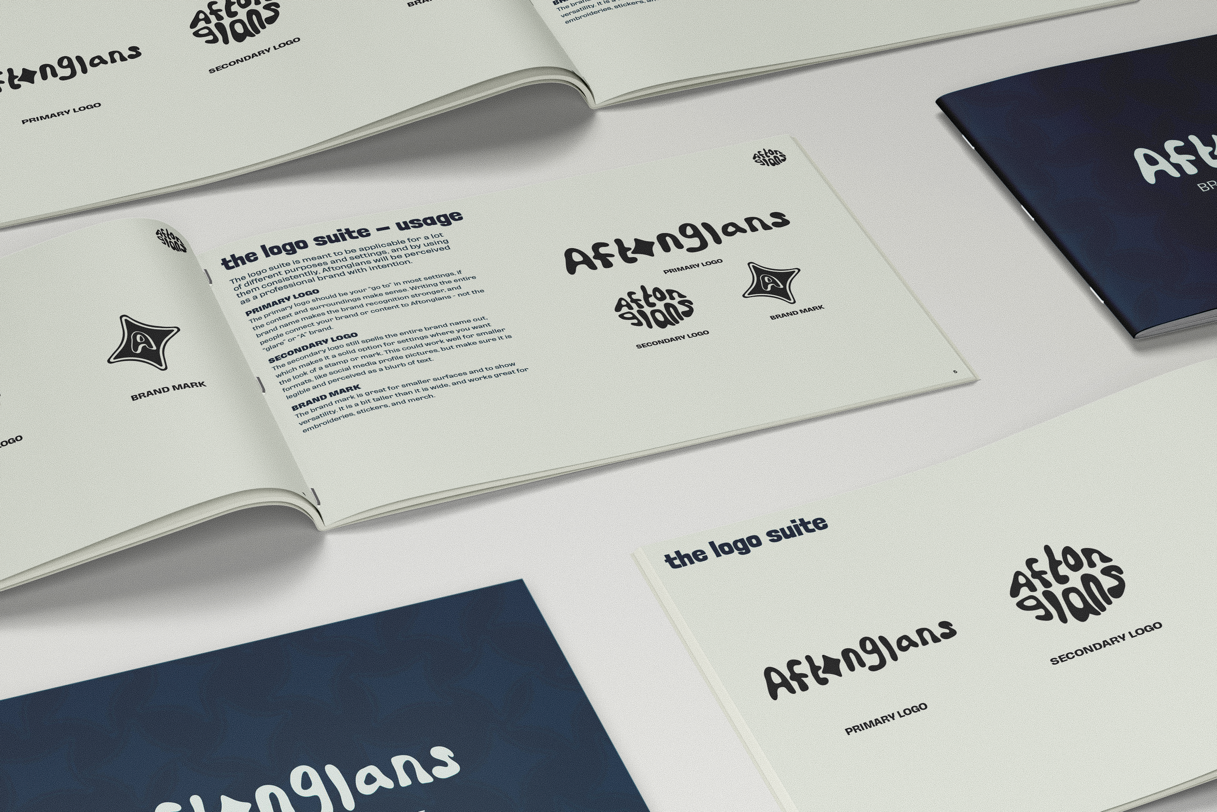
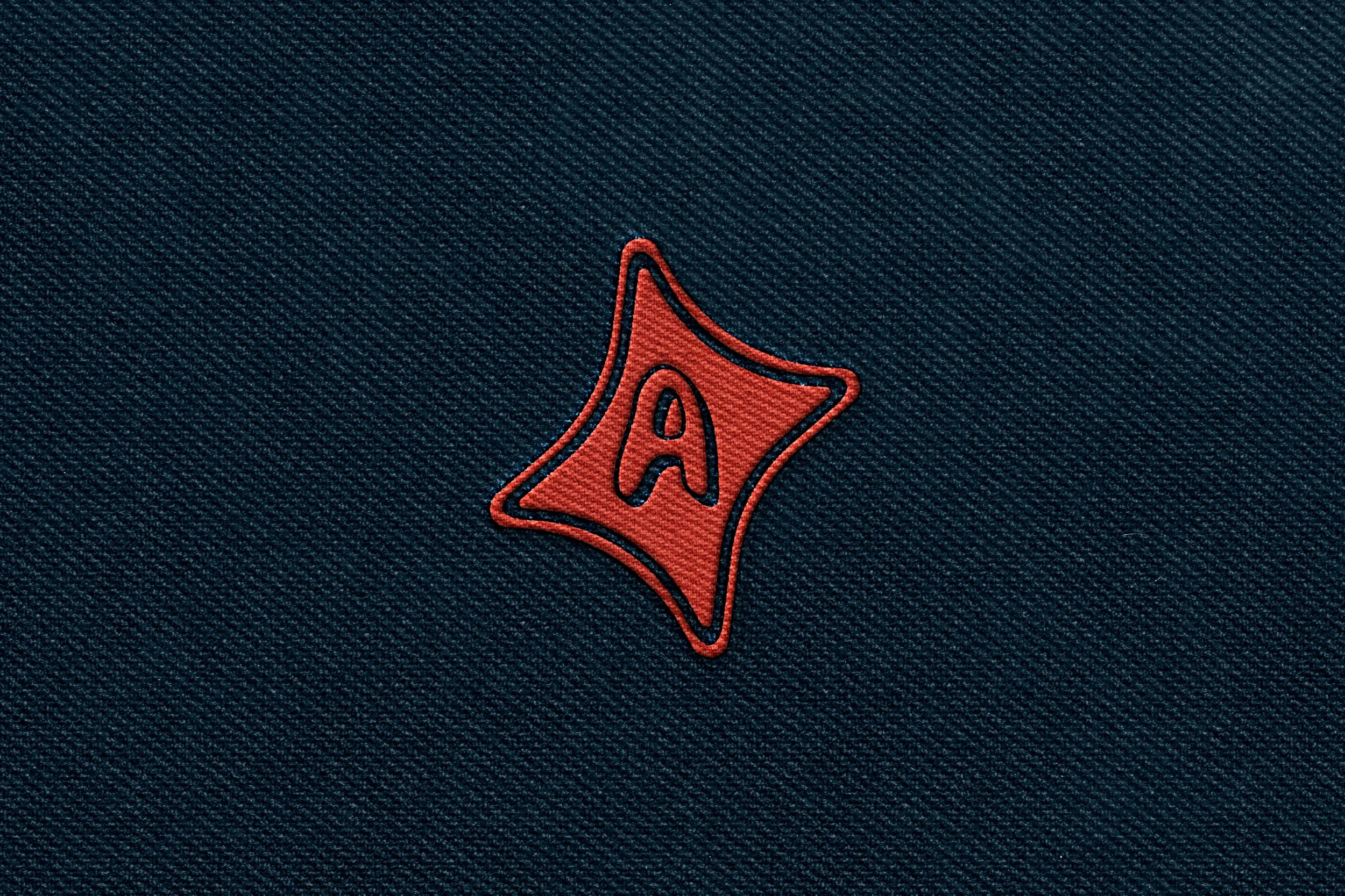
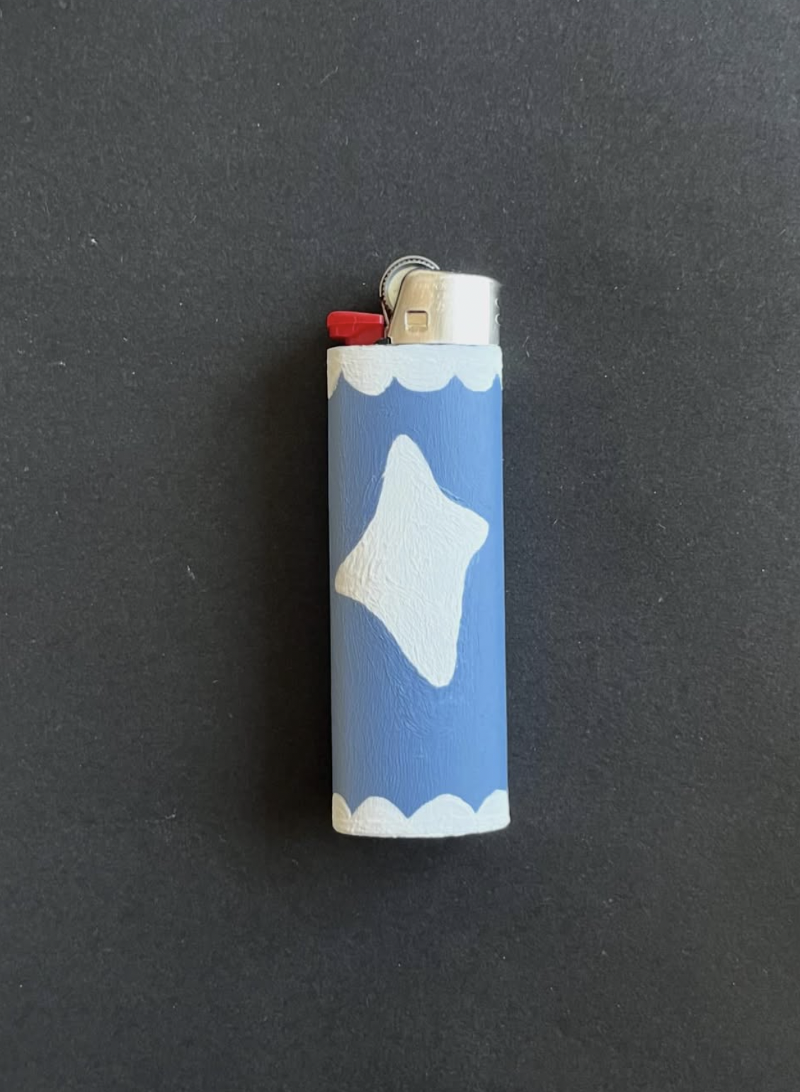
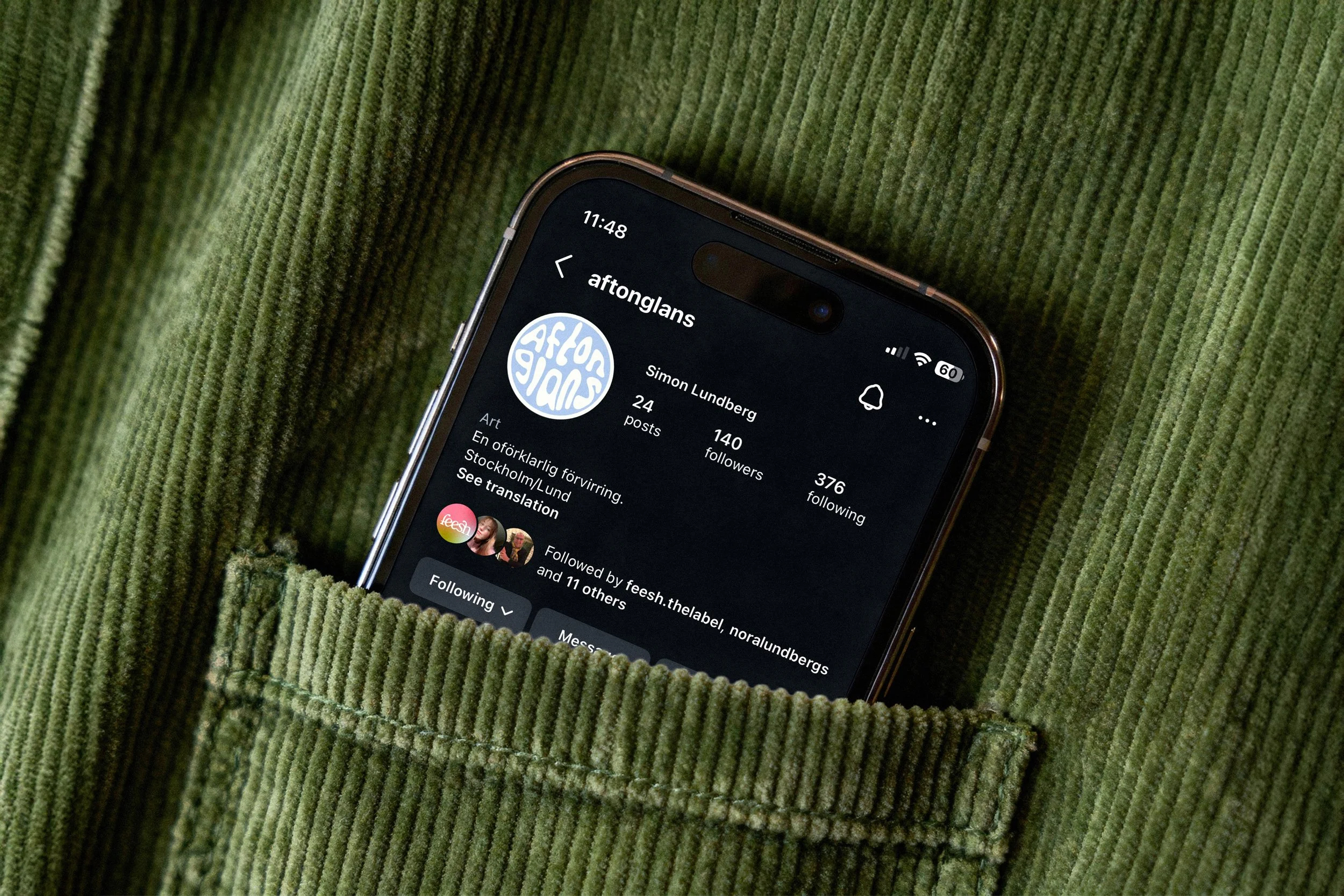
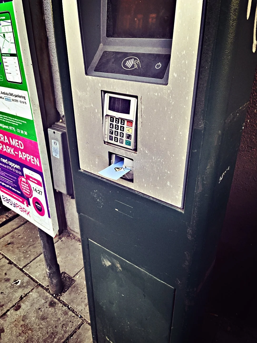
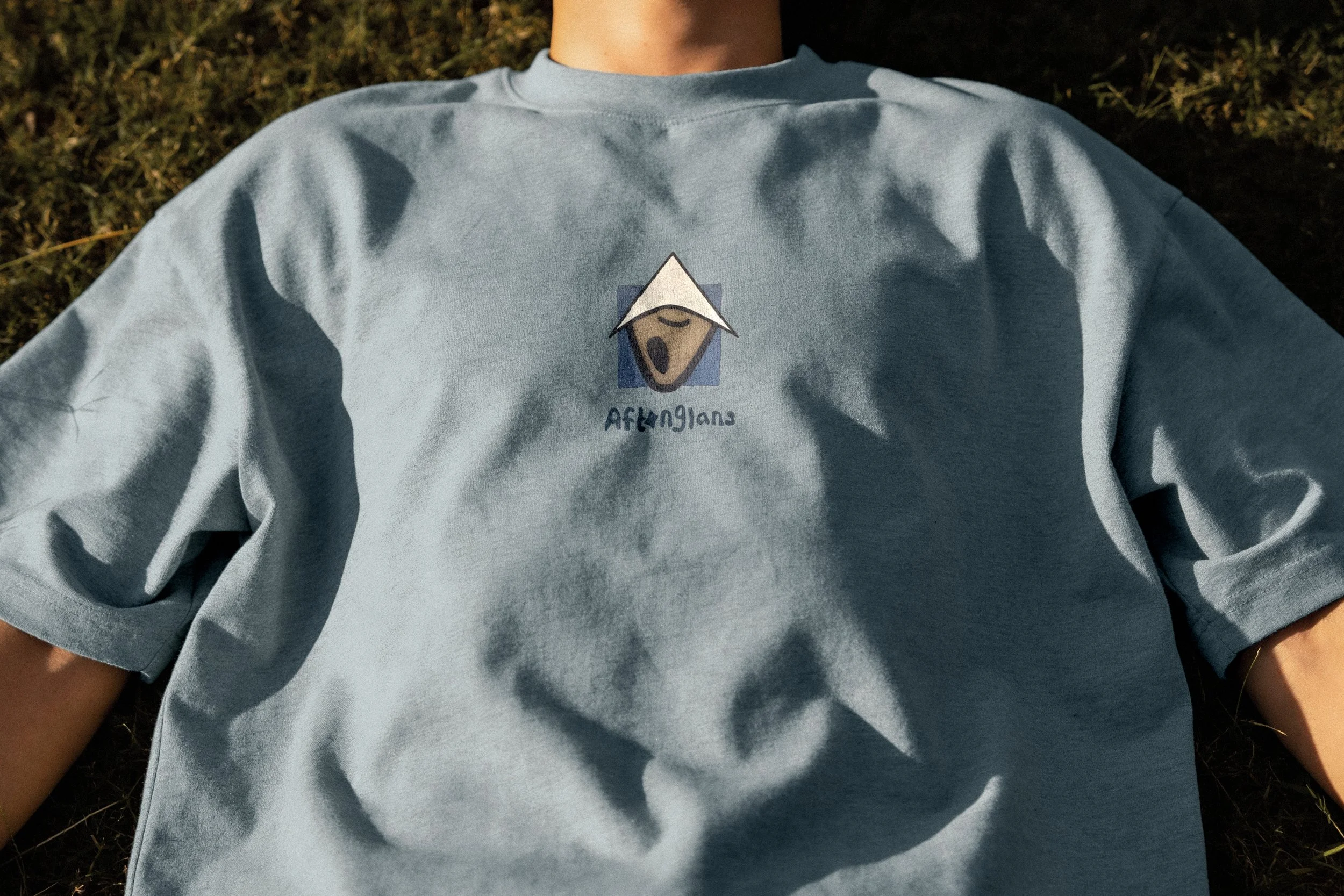
We settled on a conceptual direction that drew on the abstract color blocking and simple shapes found in Aftonglans’ and Haring’s art, while making it more modern and scalable. The logo suite includes a primary logo, a secondary logo, and a brandmark. The primary logo is a hand-drawn logotype with varying letter heights, optically aligned to the center line. It has uneven strokes and a stylized o, a visual nod to a sunbeam hitting the water at sunset. The secondary logo uses the same foundation as the primary logo, but the letters are warped into a circle. The brandmark acts like both an icon and a sticker design for the artist’s shipping kit. The overall expression is soft and wobbly, but intentional.
The brand colors are medium-deep, muted, and earthy—inspired by the gritty urban 90s and hot summer nights. The typefaces are two playful sans serifs. Both have a handcrafted quality, with irregularities like uneven, asymmetrical weights and strokes.
How Did It Go?
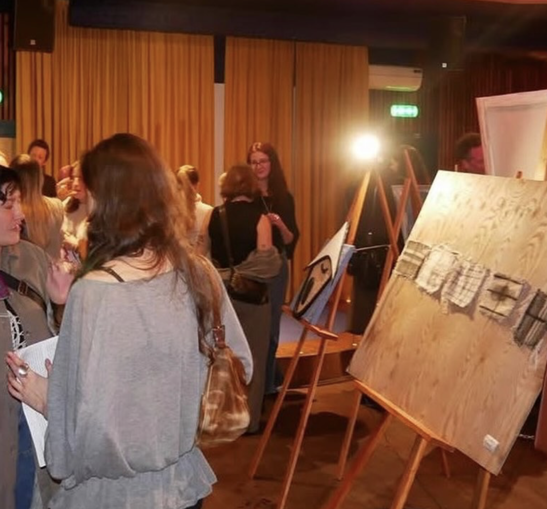
Since the rebrand launched, Aftonglans has gained 50% more followers, sold his first painting, and had his first gallery feature. I’ve been hired again afterward to create business cards.