Feesh the Label
Feesh the Label is a Santa Cruz-based jewelry brand that launched in 2025. They sell handcrafted glass jewelry with stunning natural motifs in bright, fun colors, and they want clients to feel like mermaids on land. Four months into their journey, I was hired to build the visual brand world around their beautiful products.
Discovery: Understanding the Problem
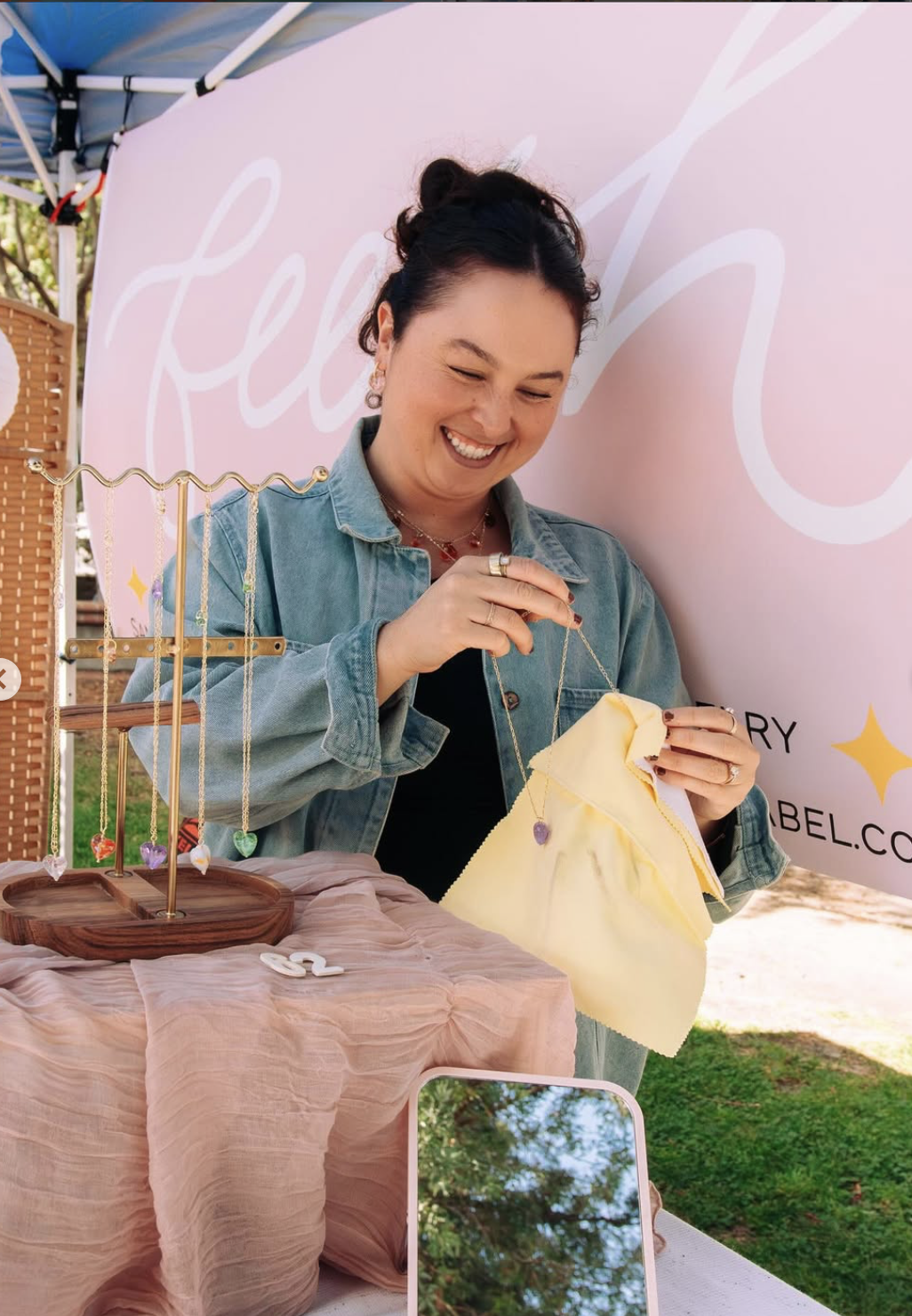
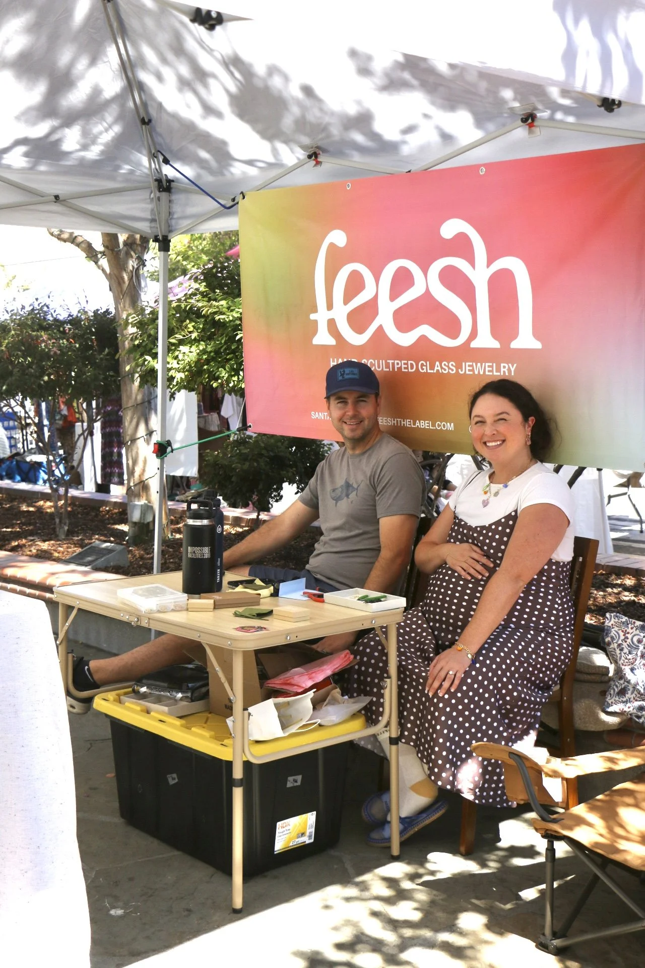
When I came in, Feesh had a stylized cursive logo, often presented in white on a baby pink background. My first interaction with Feesh was at Muse Markets in Los Gatos –the first market they ever tabled at. I was stunned by the jewelry and founder Tamara’s bubbly, warm personality. The branding and website clashed with this irl representation of the brand. I met with Tamara, and we talked about what Feesh was, what she wanted it to be, and how it is currently run.
My key takeaways from that meeting were:
Feesh was a new brand, so there wasn't much data to work from, but she had a clear vision
Feesh was run solely by Tamara, so she would have to manage many deliverables herself.
Markets and online sales generated revenue, and markets were an important funnel for driving sales to the website.
Although markets were important at the time, they wanted to shift toward other revenue channels, like wholesale or more online orders.
The products are made from natural materials, and the brand is based in Santa Cruz, so the connection to environmentalism, beach life, and sea life is huge. The name itself is inspired by fish and is a recurring motif in their collections.
Conceptual Development
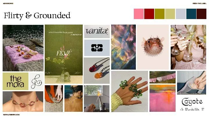
After my chat with Tamara, I moved on to competitor analysis and visual research. I found that many of her competitors were local brands leaning heavily on an eco-friendly vibe, with brown and beige colors and minimalist design systems. At the other end, handcrafted glass jewelry often has a grittier, urban look that clashes with the vibe Feesh exudes. We settled on a concept that would move Feesh into a more sunlit, flirty, grounded, and clean direction.
Designing Feesh
The Logo
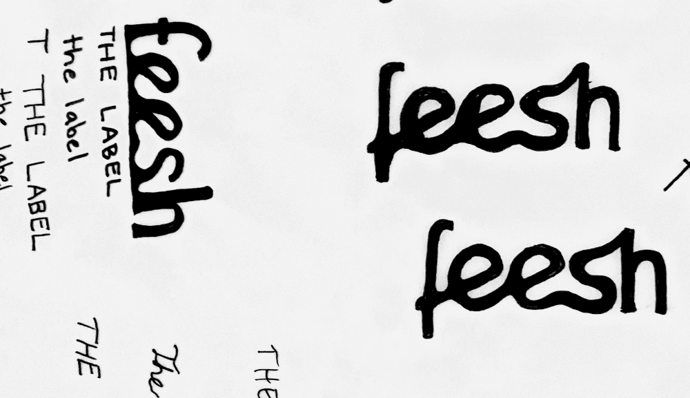
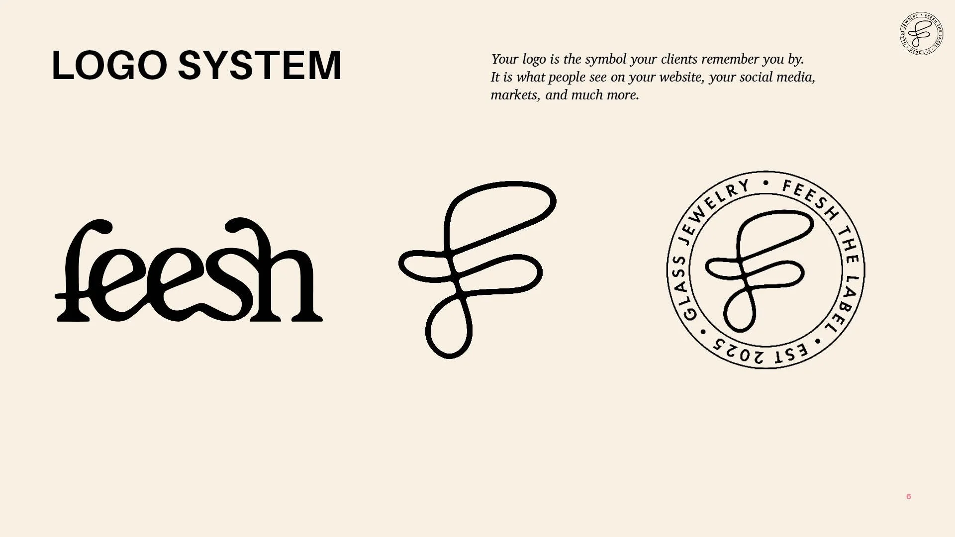
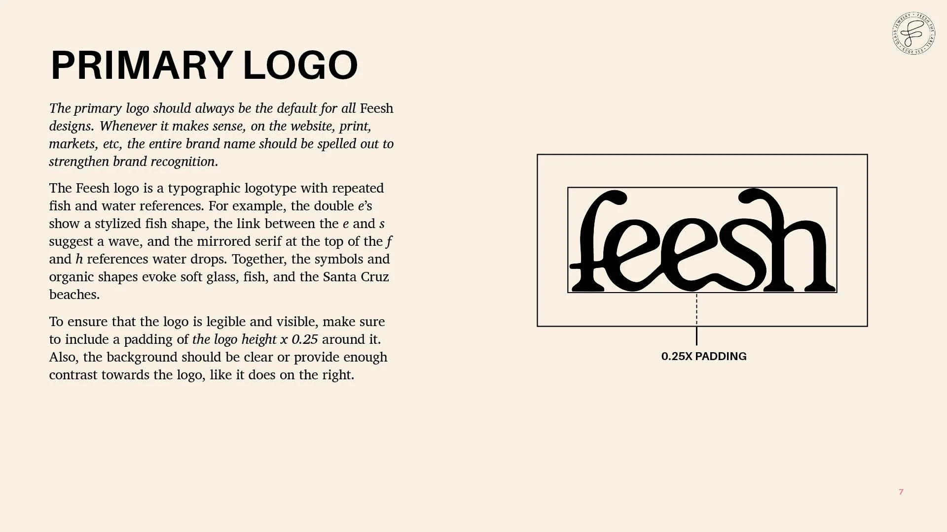
To achieve the concept we agreed on, I thumbnailed and ideated logo ideas. I wanted the logo and its variations to be easily legible from a distance at markets, and work in small formats such as jewelry tags and profile pictures. I created a logotype that imitates the structured but soft nature of glass, with the brand name spelled out and the letters flowing into each other. The f and h in the logotype mirror a droplet on their ascenders, to replicate a molten glass droplet or a water drop. The double e’s are manipulated to hint at the shape of two fish. Even with those adjustments, it is a big step away from the decorative cursive logo before, towards a more confident expression that references the actual business.
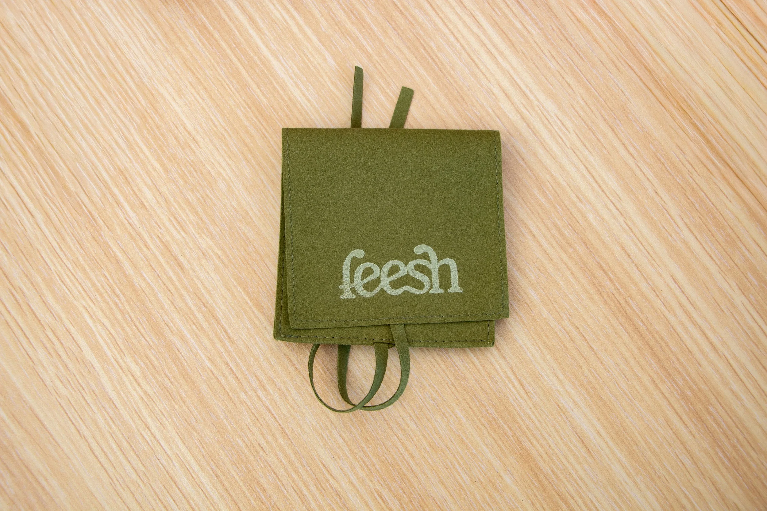
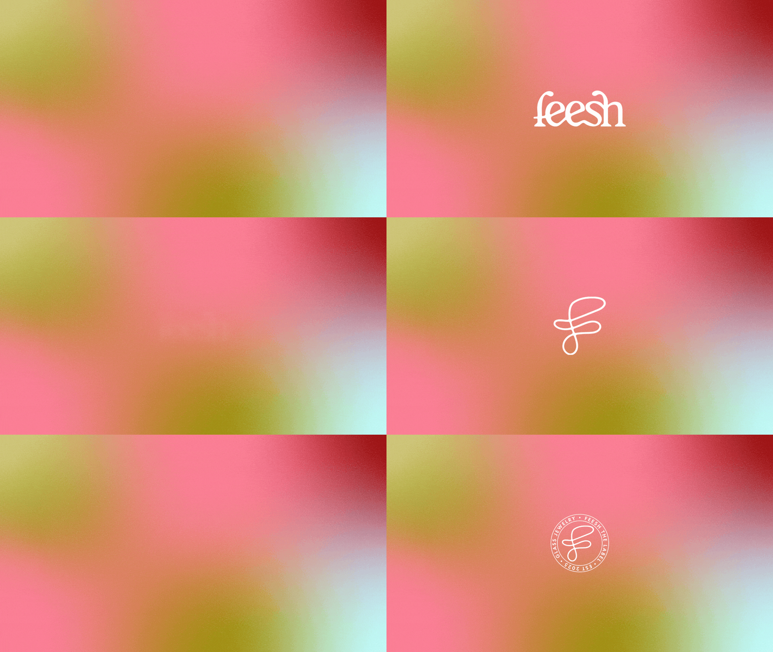
The variations are in the shape of a brandmark or stamp, and are suitable for places where they need something square or round, or as a decorative complement to the logotype, to carry the brand further where the full logotype isn’t working.
The Colors
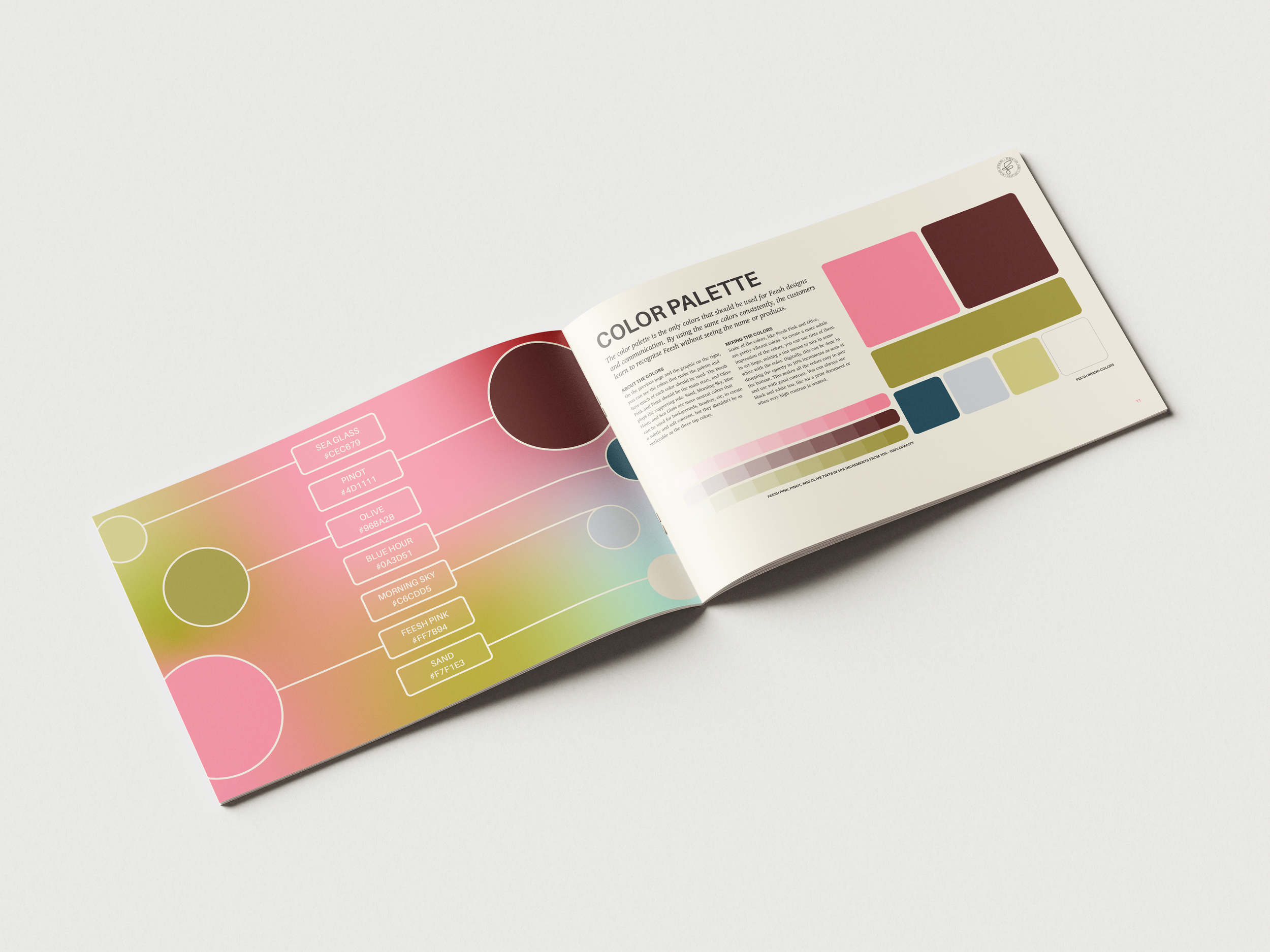
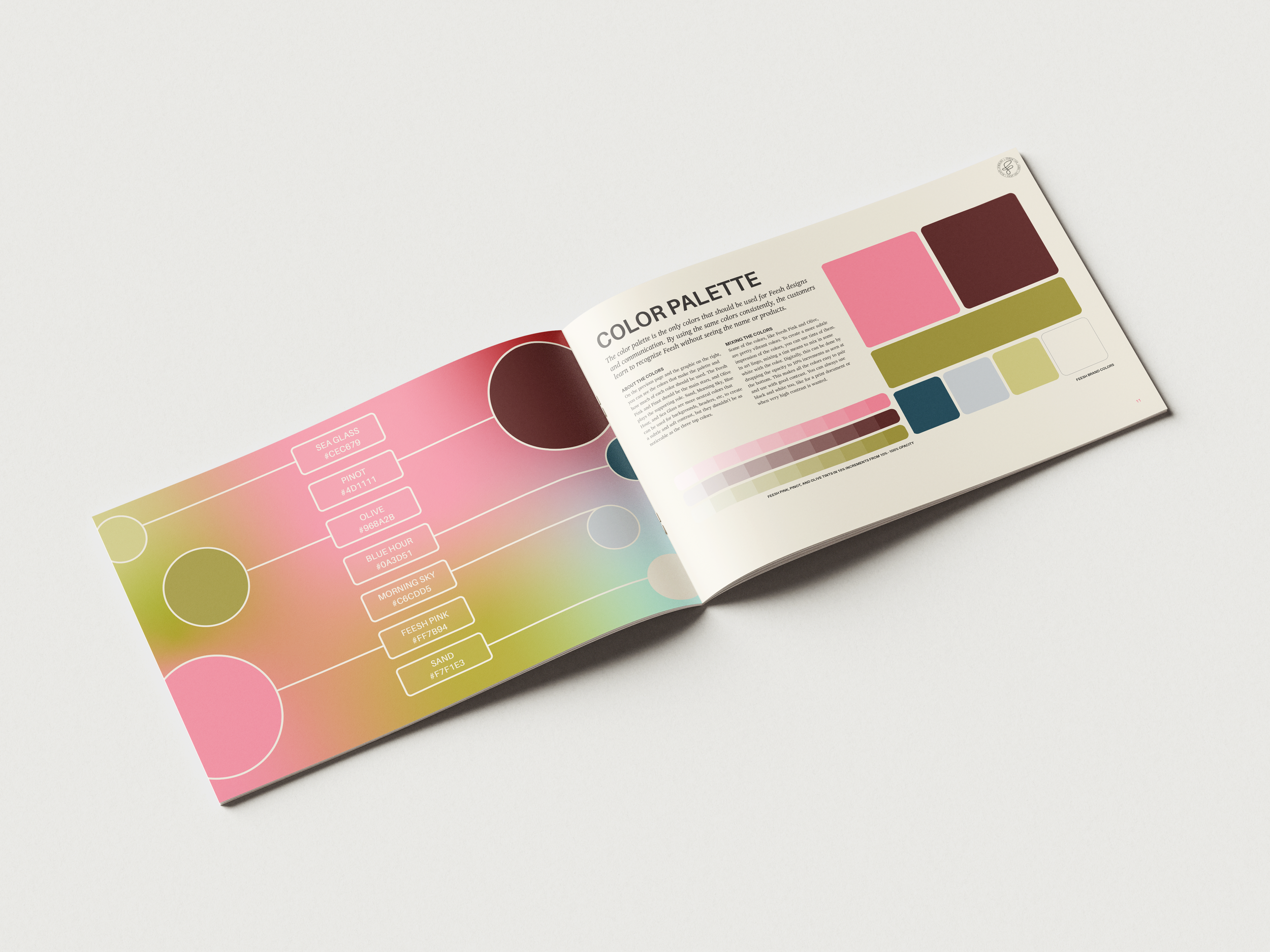
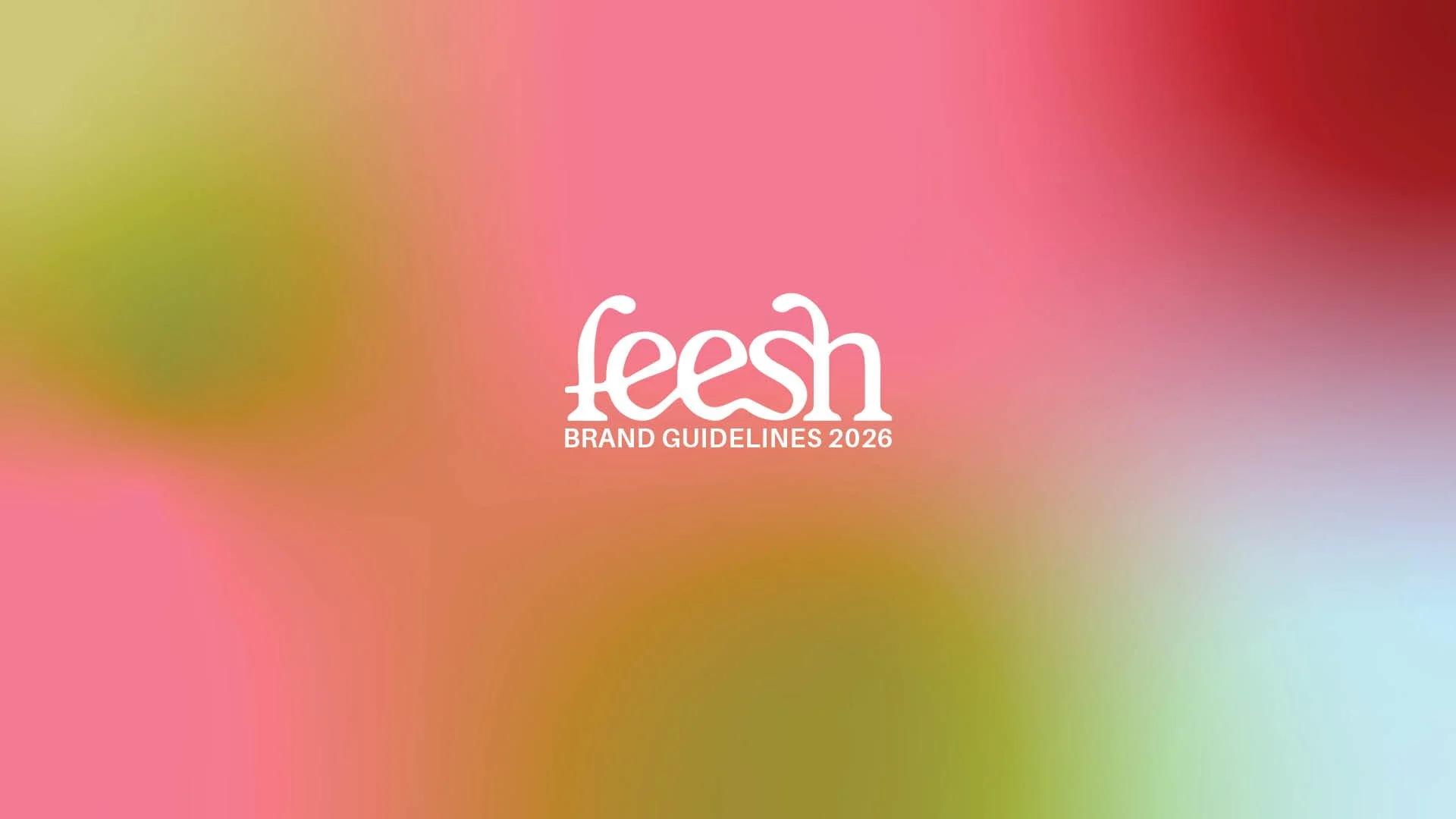
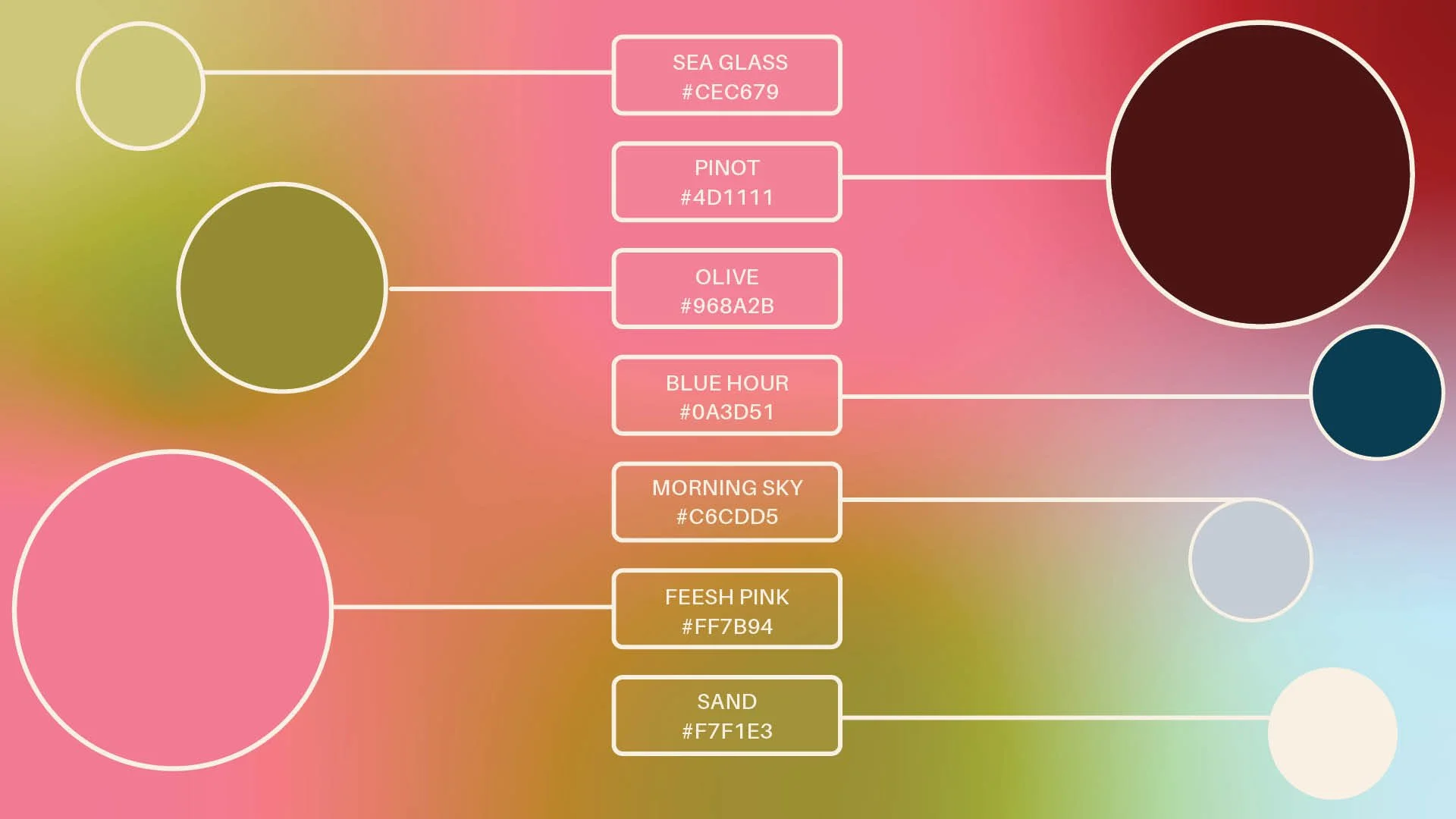
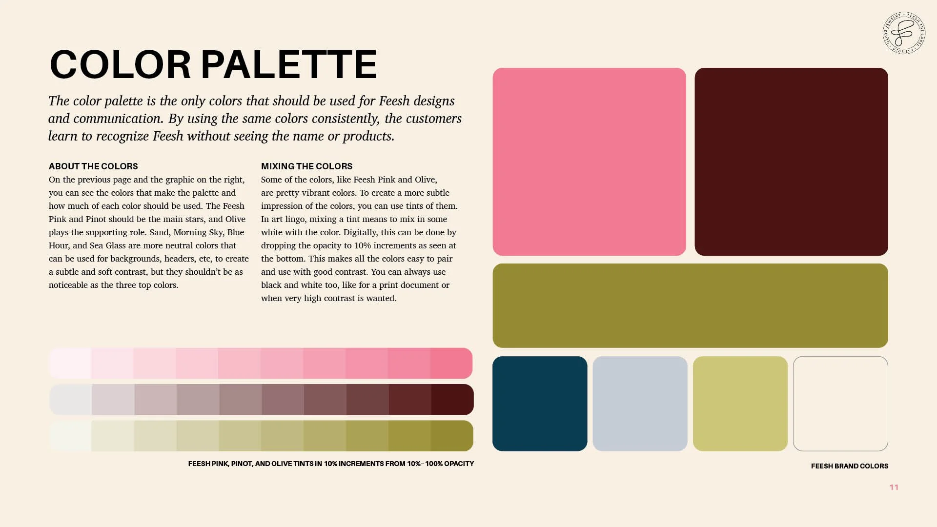
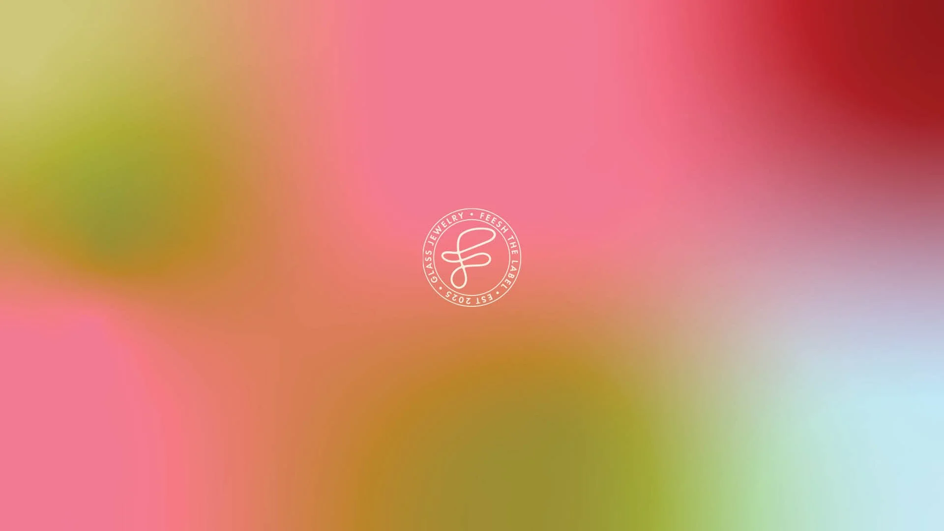
The color palette brings energy to the visual identity. Soft, slightly desaturated neutrals are contrasted with earthy, vibrant colors, such as bright pink and olive green. This creates tension and creates interest. The full color palette’s hues are used in the repeatedly used gradient that was part of the deliverables.
The Typography
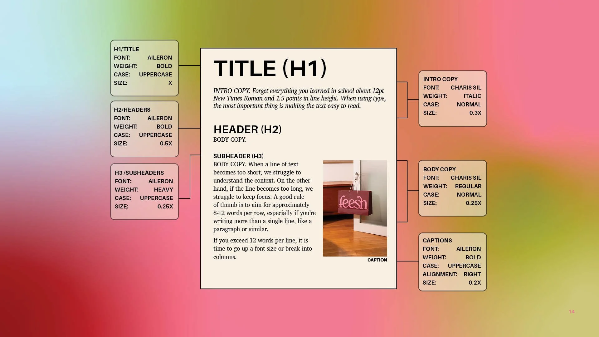
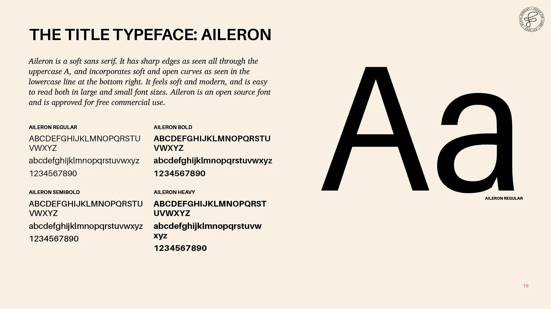
The type pairing includes two typefaces—an open, rounded sans serif for titles and headers, and a soft, legible serif for body copy. The serif softens the technical feel of the otherwise organized, structured visual identity and brand guidelines, making it feel tactile.
The Website
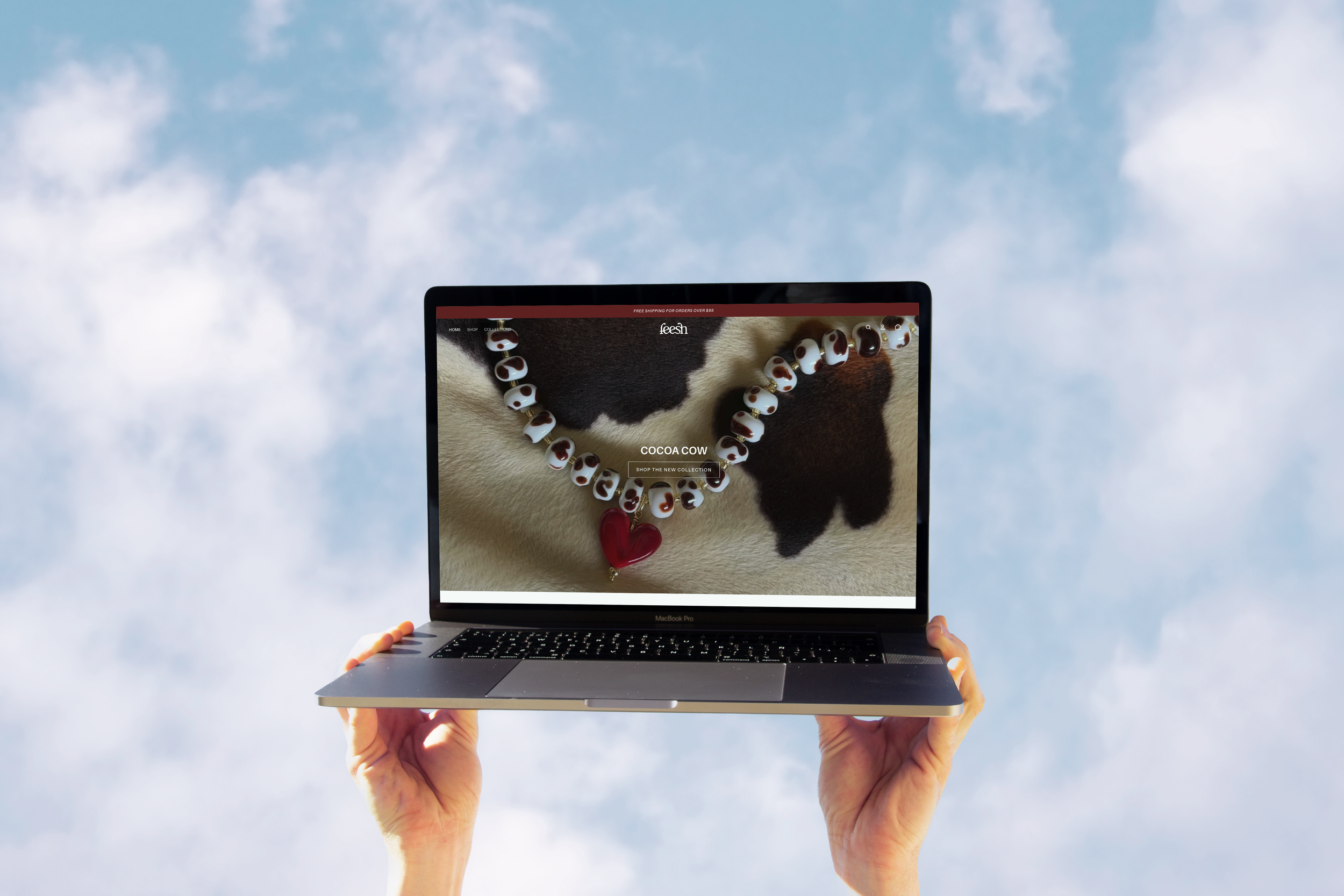
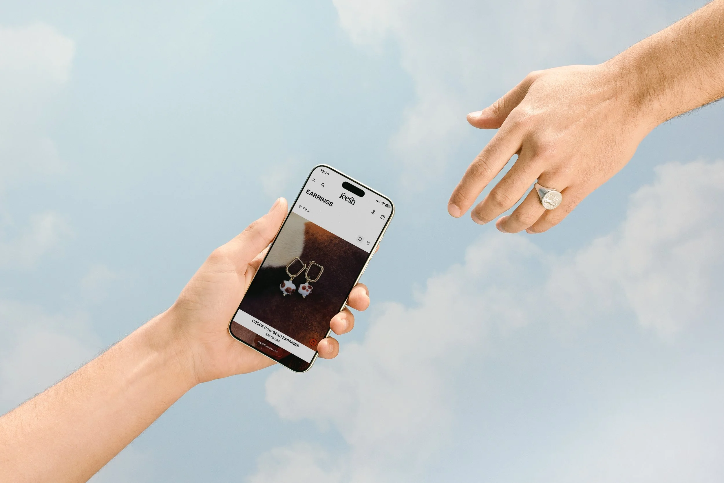
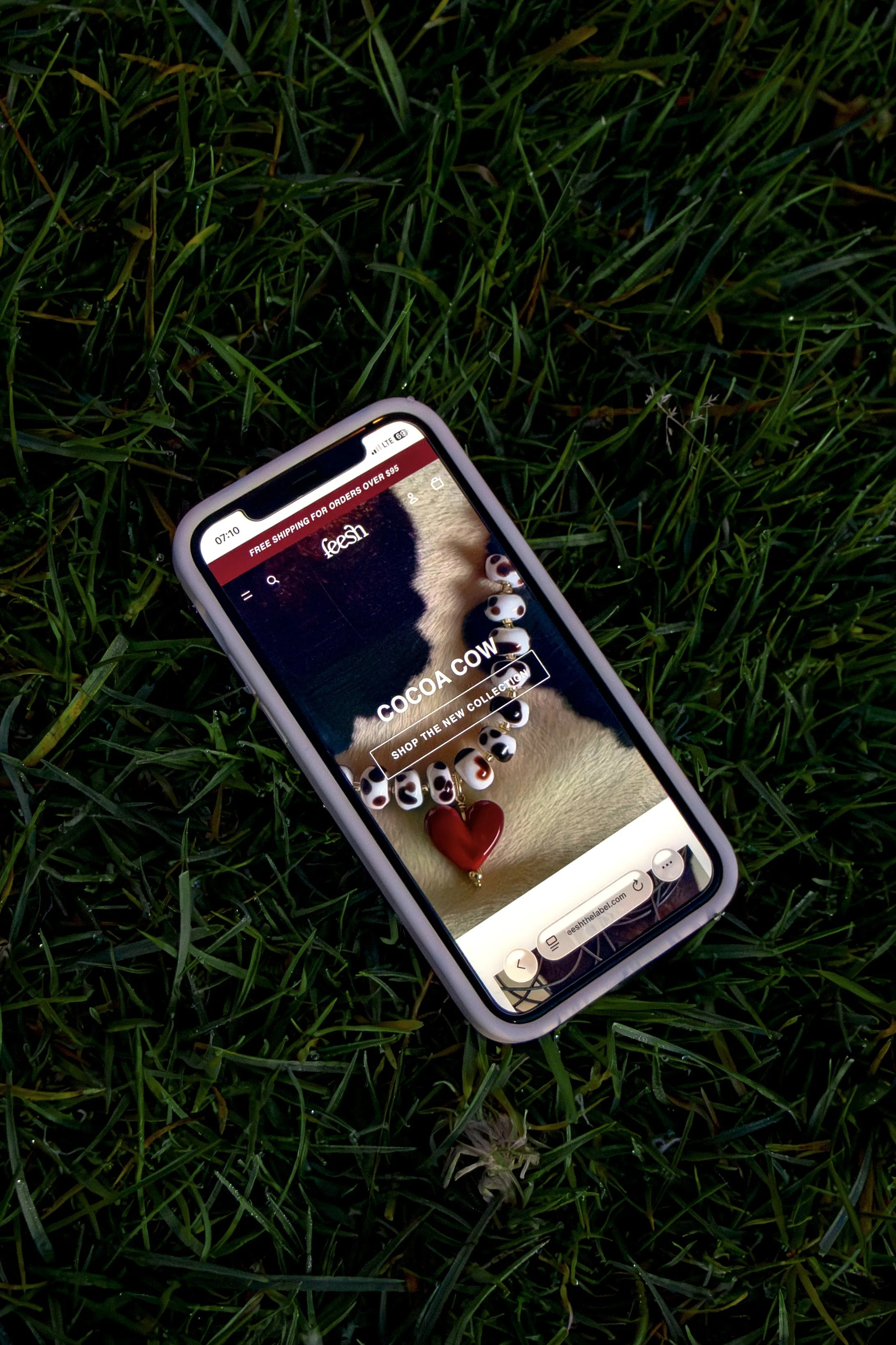
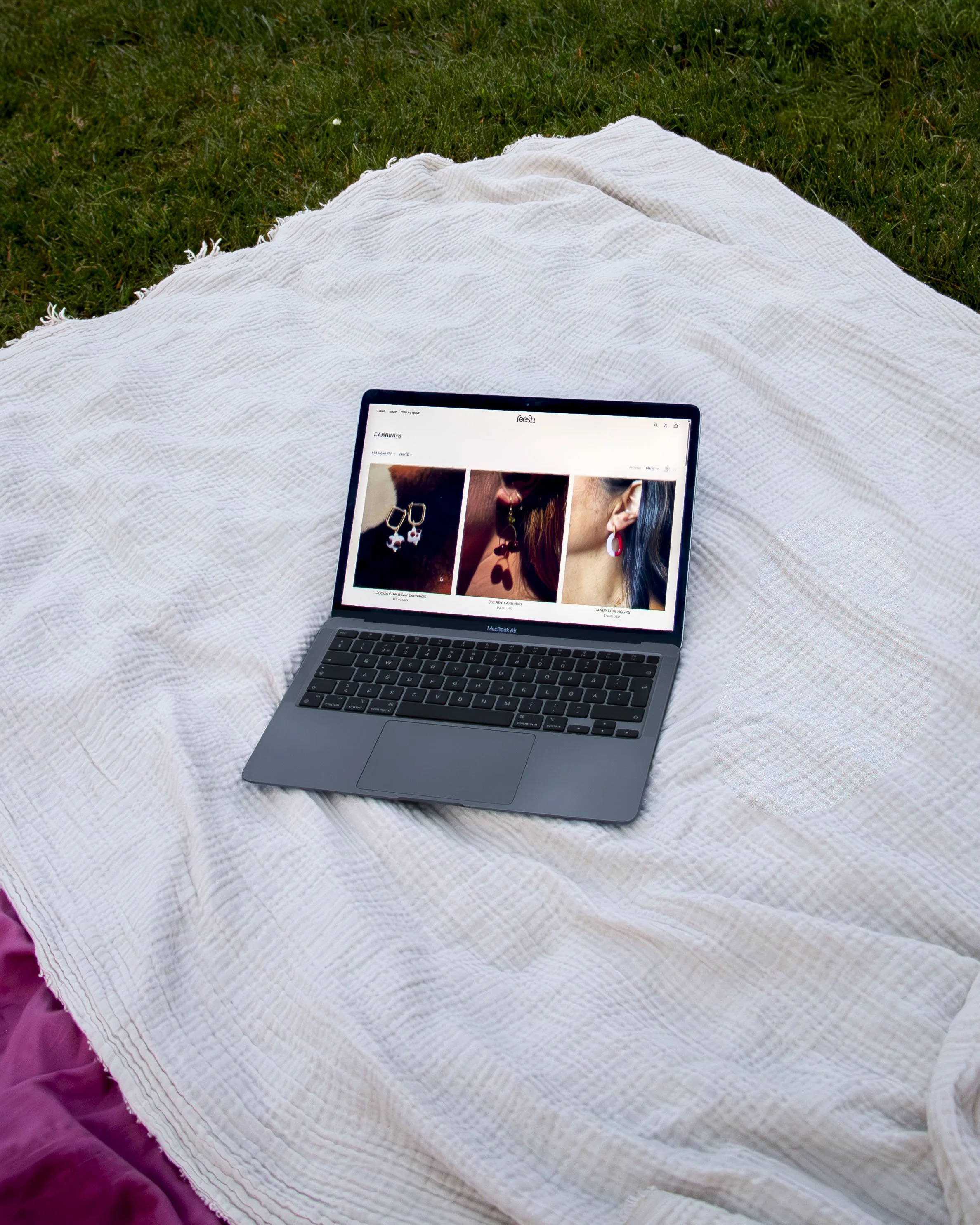
Early on, we decided to migrate the website from Square to Shopify to make scalability and customization easier. This web design focused mostly on practicality. I helped migrate the website and apply the branding and layout with custom code. The goal was to build a website that would work well, look organized and clean, represent the brand, and feel professional and reliable. We wanted to avoid excessive design features and focus on building Feesh as a trustworthy brand.
How Did It Go?
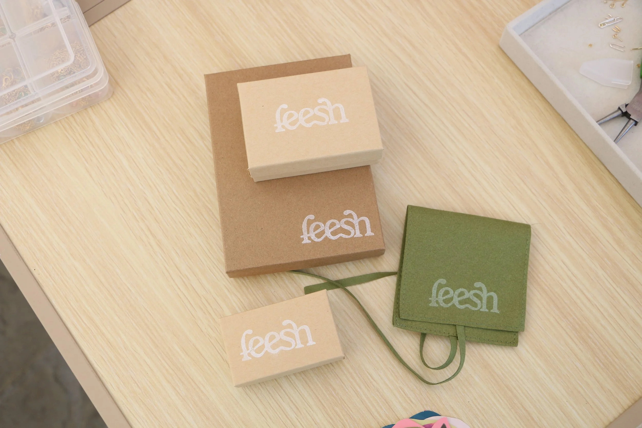
By the end of the project, Tamara had a new visual identity and website for Feesh, including a 21-page brand guide explaining the design choices and how to use the brand moving forward. The brand is now eye-catching across the market, easily recognizable on packaging, business cards, and the website. Merch and non-jewelry products also connect to the visual language of Feesh that I built in conversation with Tamara, making it feel personal, fun, and professional.
A testimonial Tamara left was a clear signal that the identity and website had landed well:
“Nora took the time and care to really understand the vibe and the vision of the brand and ultimately delivered a gorgeous brand identity deck and designed my dream website. Along the way she was extremely communicative, receptive to feedback and just a pleasure to work with….This rebrand has honestly changed everything! I’m getting so much more recognition and requests for collabs and pop-ups”