El Cerrito
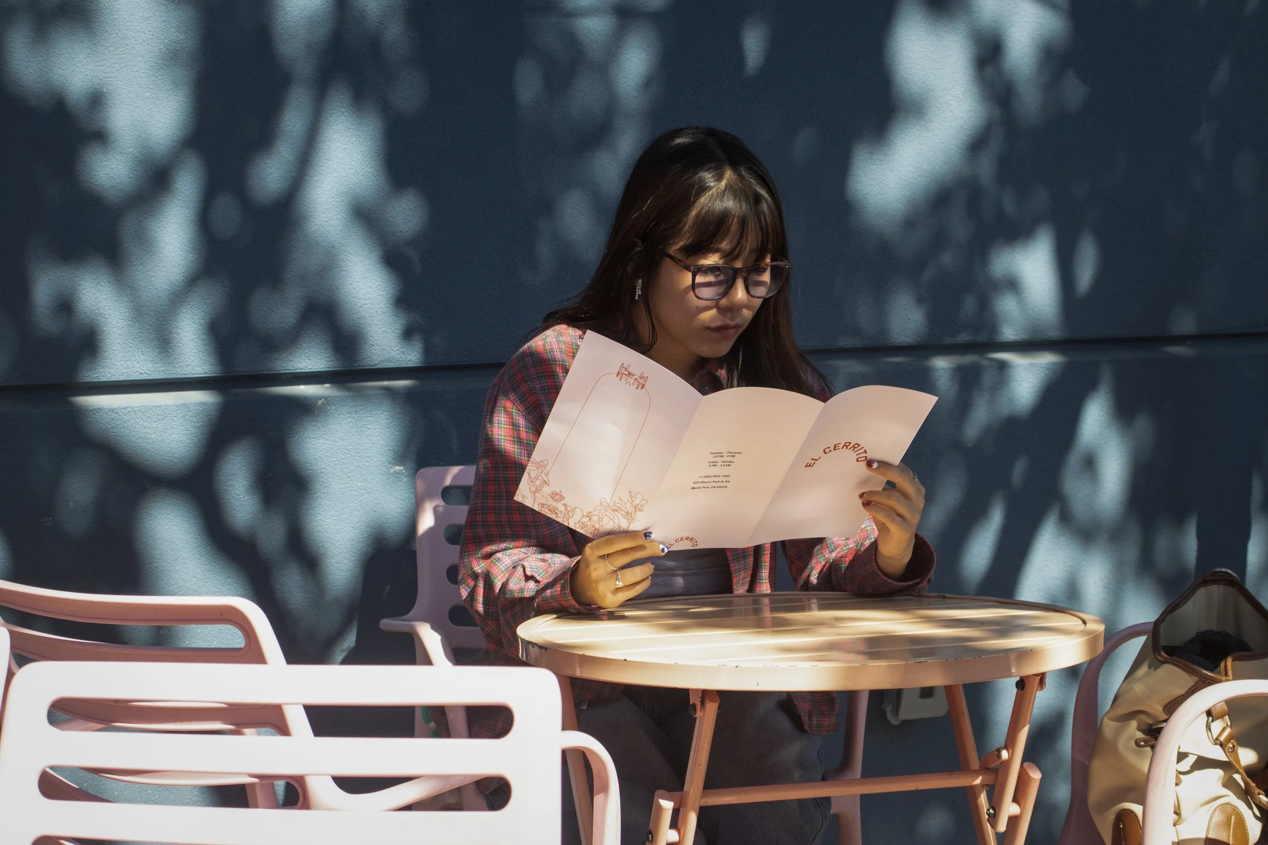
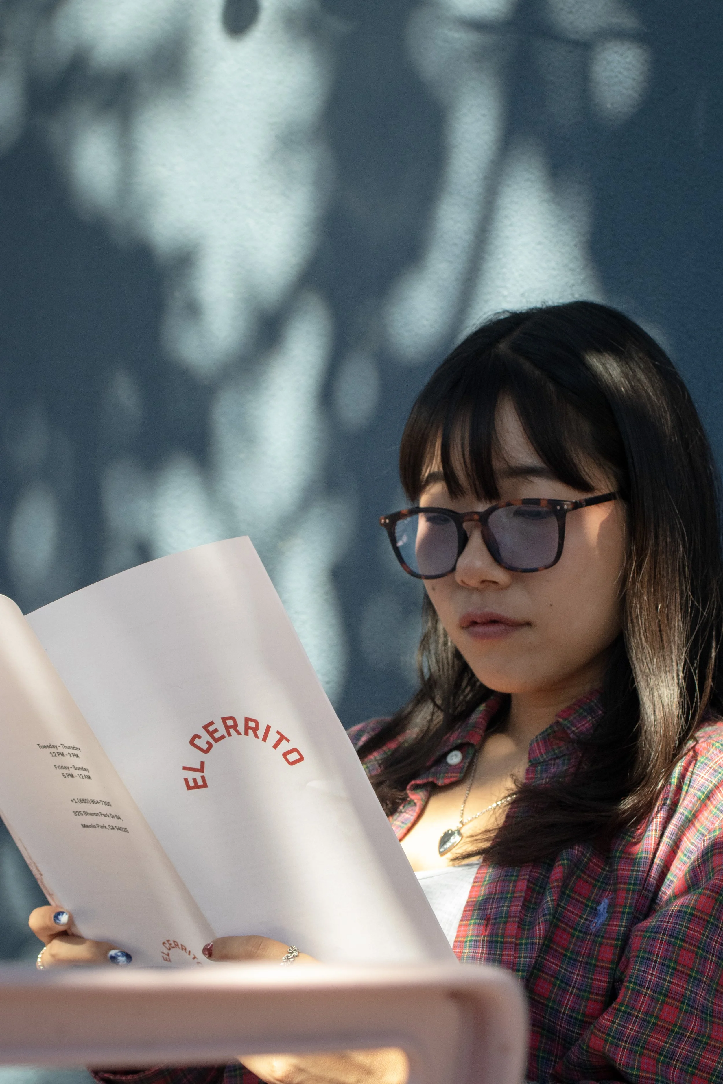
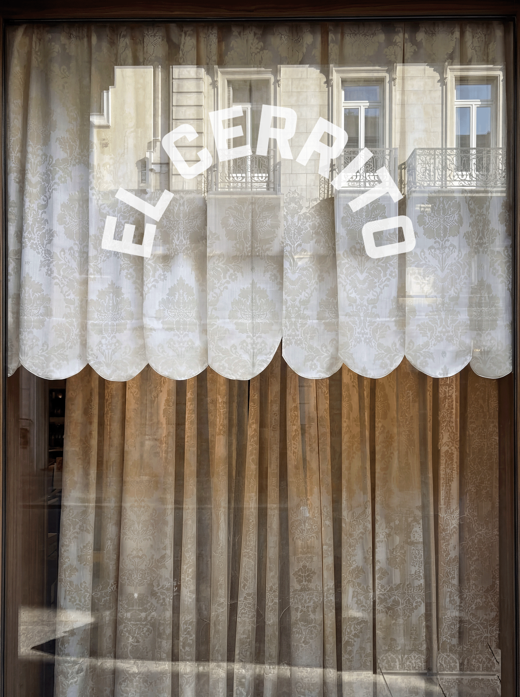
El Cerrito is a local neighborhood spot for Mexican food, with a warm, homey environment. I created a rebrand for them, including a visual identity, menu, and branded collateral. The designs use an intimate, casual visual language that maintains a personal relationship with customers while delivering an elevated experience.
Research
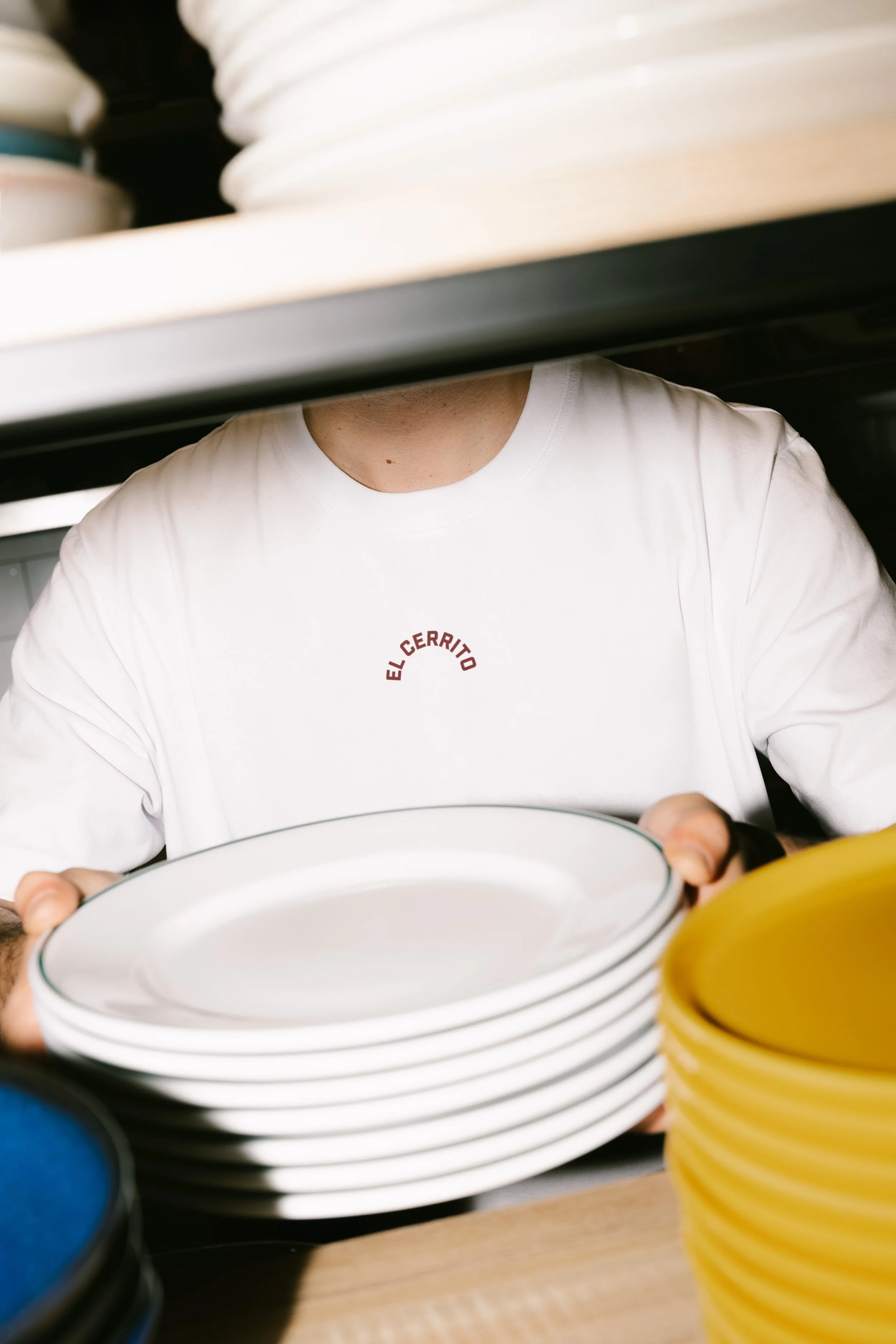
I visited the restaurant and reviewed their branding, menu, and overall impression. They had no consistent branding; wherever the name appeared, the visuals were very different. The menu was laminated and overcrowded with bleached photos, which made it feel cheaper and less like a nice atmosphere than the service, food, and environment created. There was a huge clash between the feeling of being there and the look of their designs.
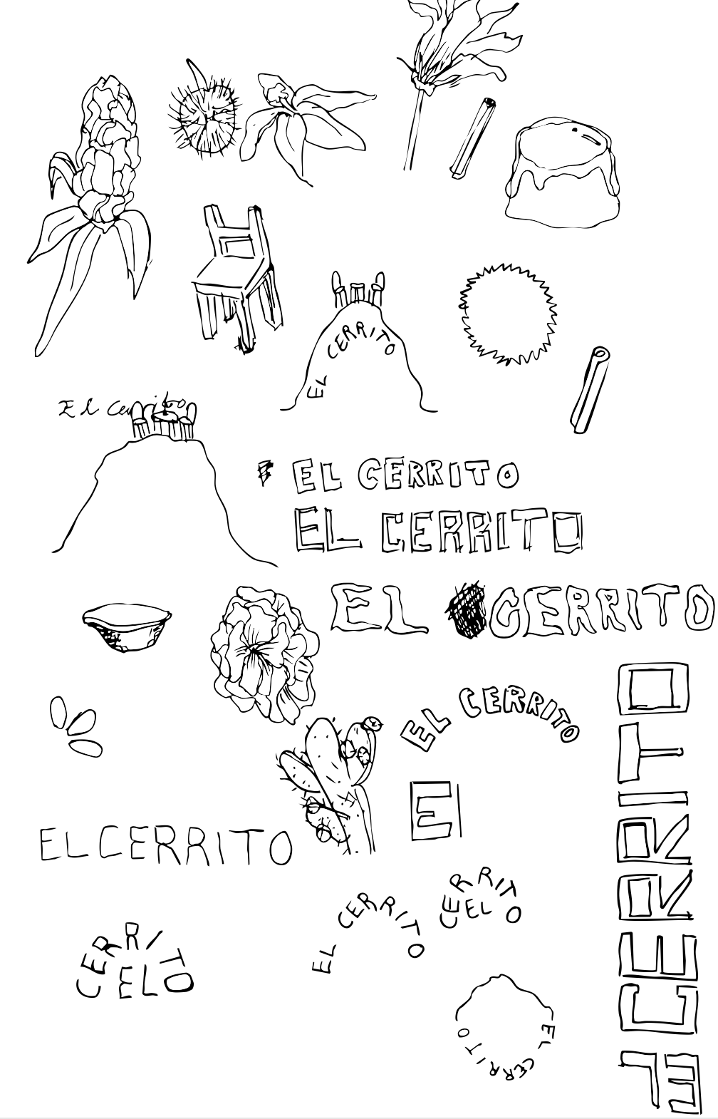

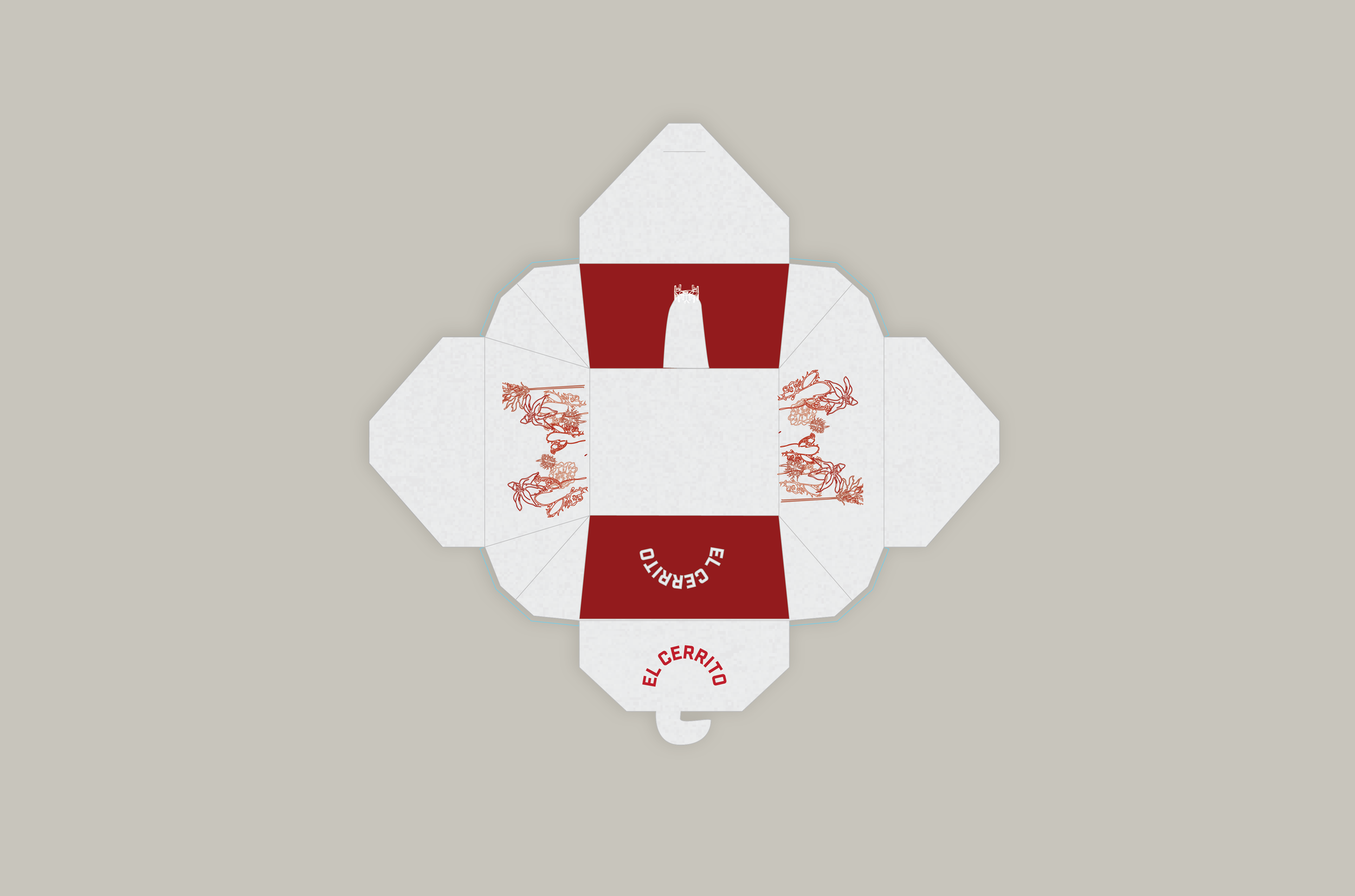
After the visit, I researched and thumbnailed a lot of ideas, motifs, and elements related to Mexican food, the restaurant, and the name, which translates to "the little hill." This led to sketches of edible flowers, an accentuated hill, curved lettering, and spices. Many of the sketches were later digitized and made it onto the final menu, napkin, and to-go-box designs.
Designing El Cerrito
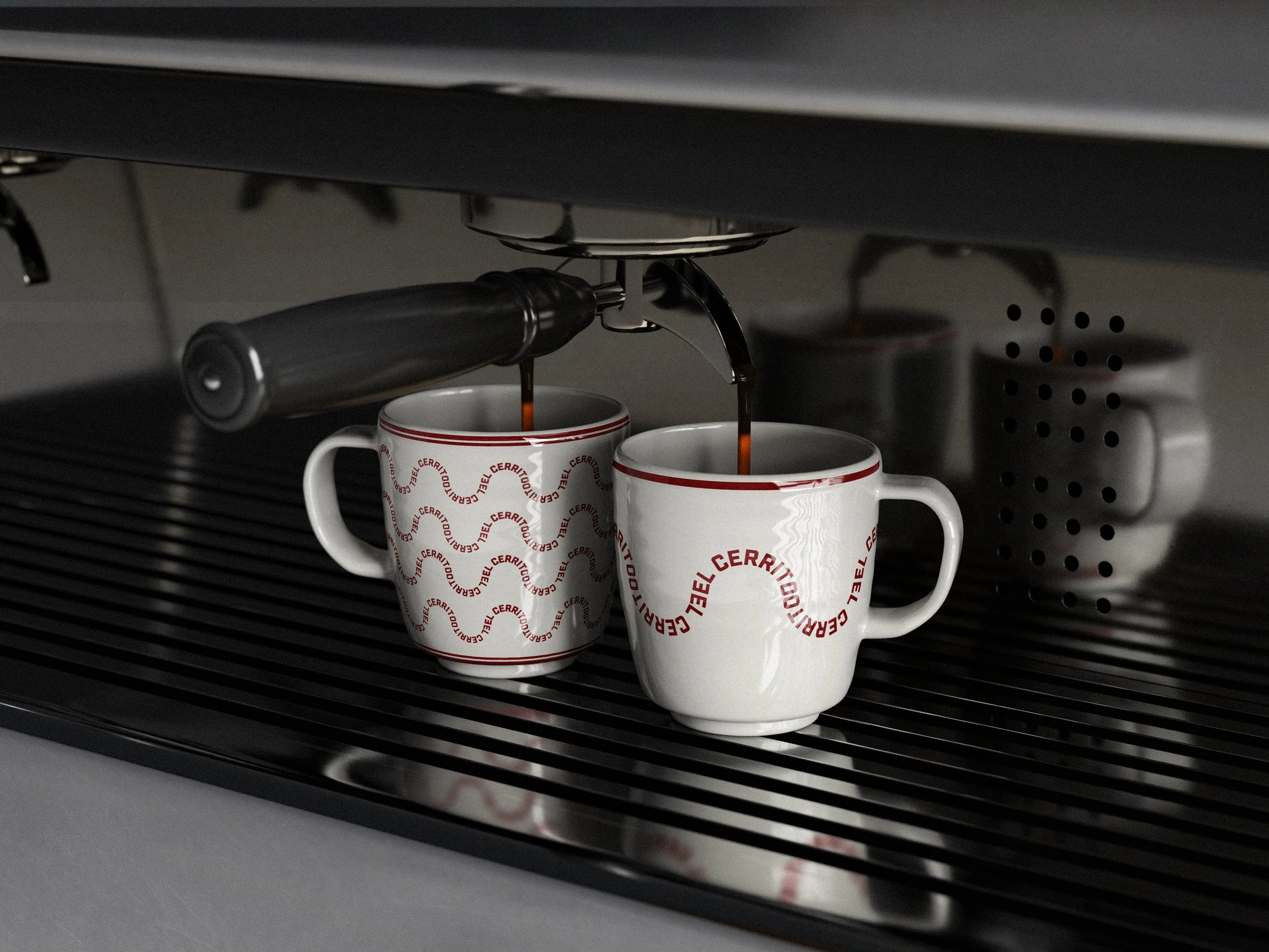
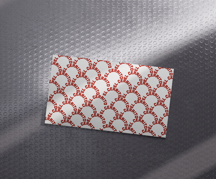
“El Cerrito” translates to “the little hill,” which inspired the logo. The simple, curved brand name reflects that: a little hill. Its scaled-back nature makes it feel natural and obvious in the best way. If the logo is simple and bold, it shows the business doesn’t need ornate decorations to prove its quality; it just needs to be striking enough to catch the viewer’s attention.
Color-wise, the dark red plays into Mexican associations while staying elegant and not too on the nose. For the logo, titles, and headers, a boxy, bold sans-serif demands attention without being harsh or overly decorative. The subheading and body copy typeface is another sans-serif font that is a bit more curved and traditional.
Throughout the branded designs, especially in the menu, the focus is on handcrafting, keeping the visual language intimate and personal for the restaurant’s customers. The type design mimics a typewriter, and the illustrations are exaggerated sketches that celebrate Mexican food culture, as if someone sketched them on a napkin.