Fibershed
Fibershed is a nonprofit in Northern California, working to make the textile industry more sustainable. They educate people and businesses on how they can use traditional and new techniques to make the most of what is available locally, and how to farm generatively. I created this rebrand for them, with the goal to bring a breath of fresh air and new thinking into a field that is often very predictable.
Research
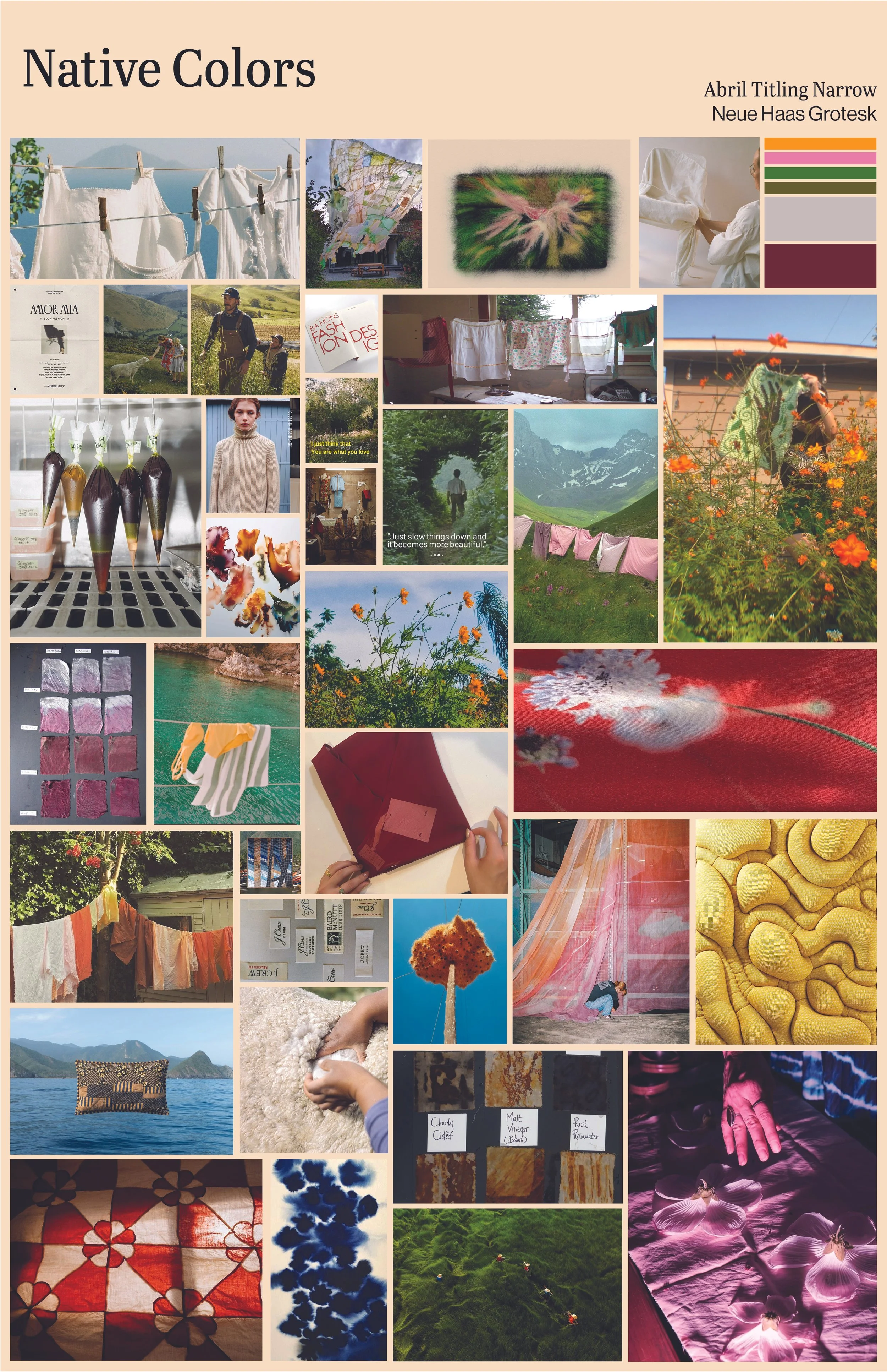
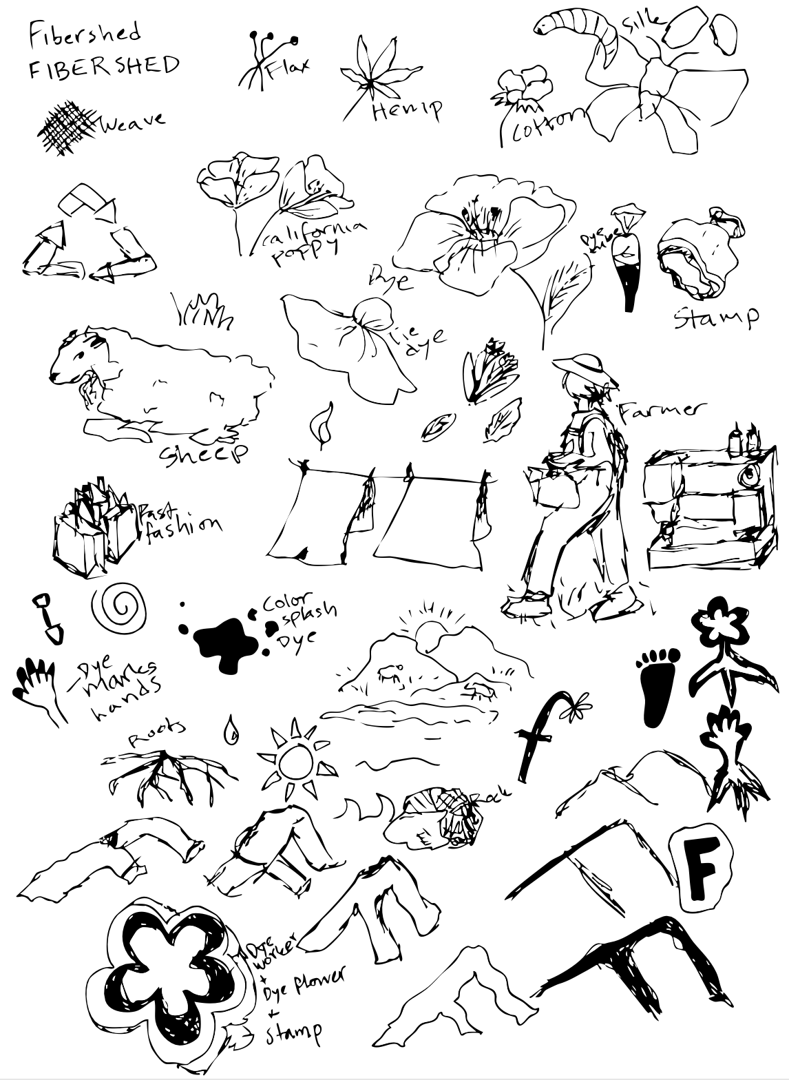
As the initial phase of this project, I conducted research by learning what the organization stands for and what their mission is. After learning about their California base and how they value not only local textile production but fiber production as well, I wanted to learn more about which California native plants and flowers are used in producing fiber, dye, and final fabric.
After that, I wanted to know more about the place they chose as their home, Point Reyes. It is a hilly coastal landscape on a peninsula north of San Francisco. It is home to kettle, sea lions, and birds. It is incredibly windy and green, very dramatic.
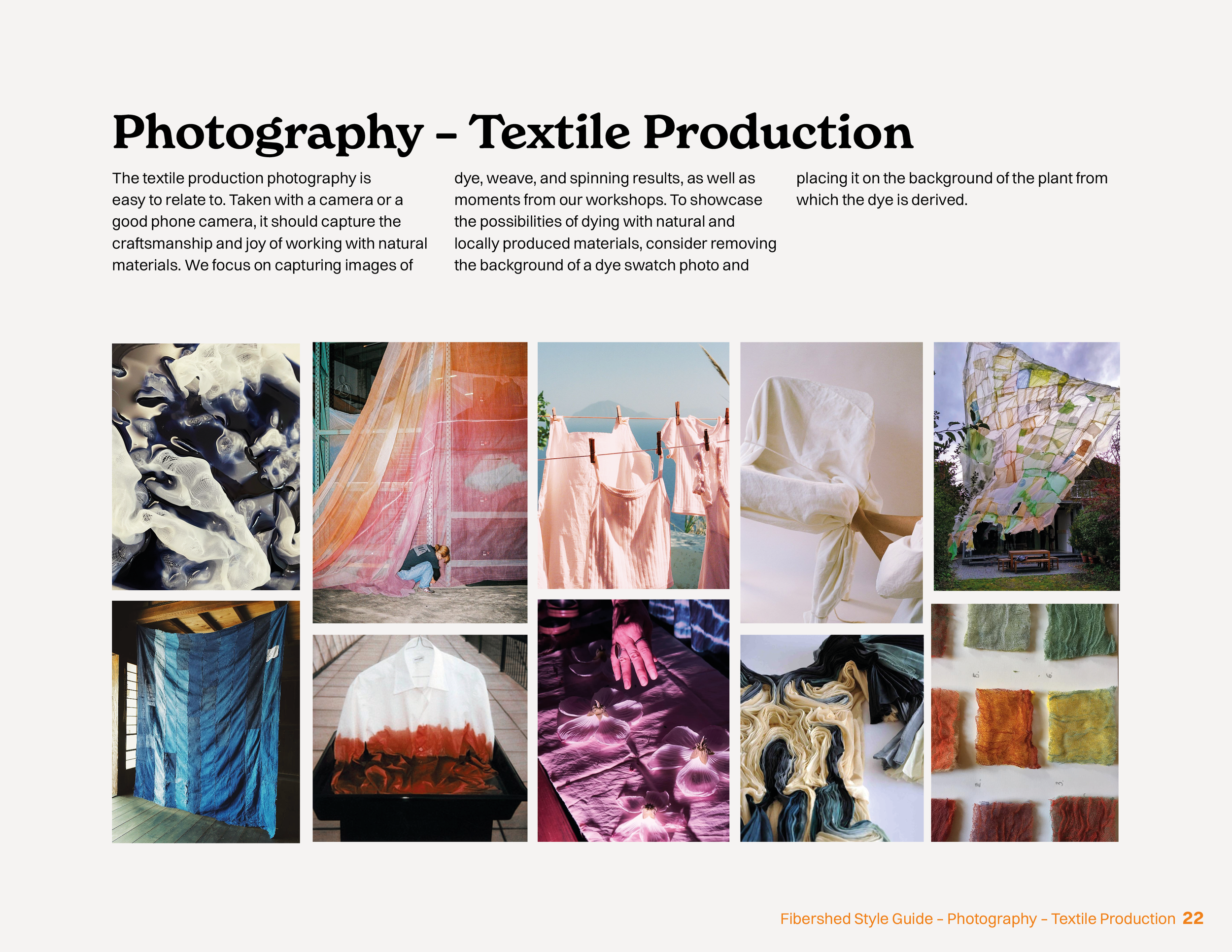
I knew that I wanted to encapsulate all this in the final art direction for this project. I wanted it to read as everyday life, achievable but stunning. It’s the core of sustainable production, making sure the earth and surroundings are protected and valued, while making products that represent the culture. It is a loving and colorful process, not a bleak and dusty one.
Designing Fibershed
As previously mentioned, I focused this rebrand around liveliness, tactility, and forward thinking. Instead of only attracting a niche group of already sustainable businesses wanting to learn more, the goal of the rebrand was to build interest from other audiences that might need the education even sooner.
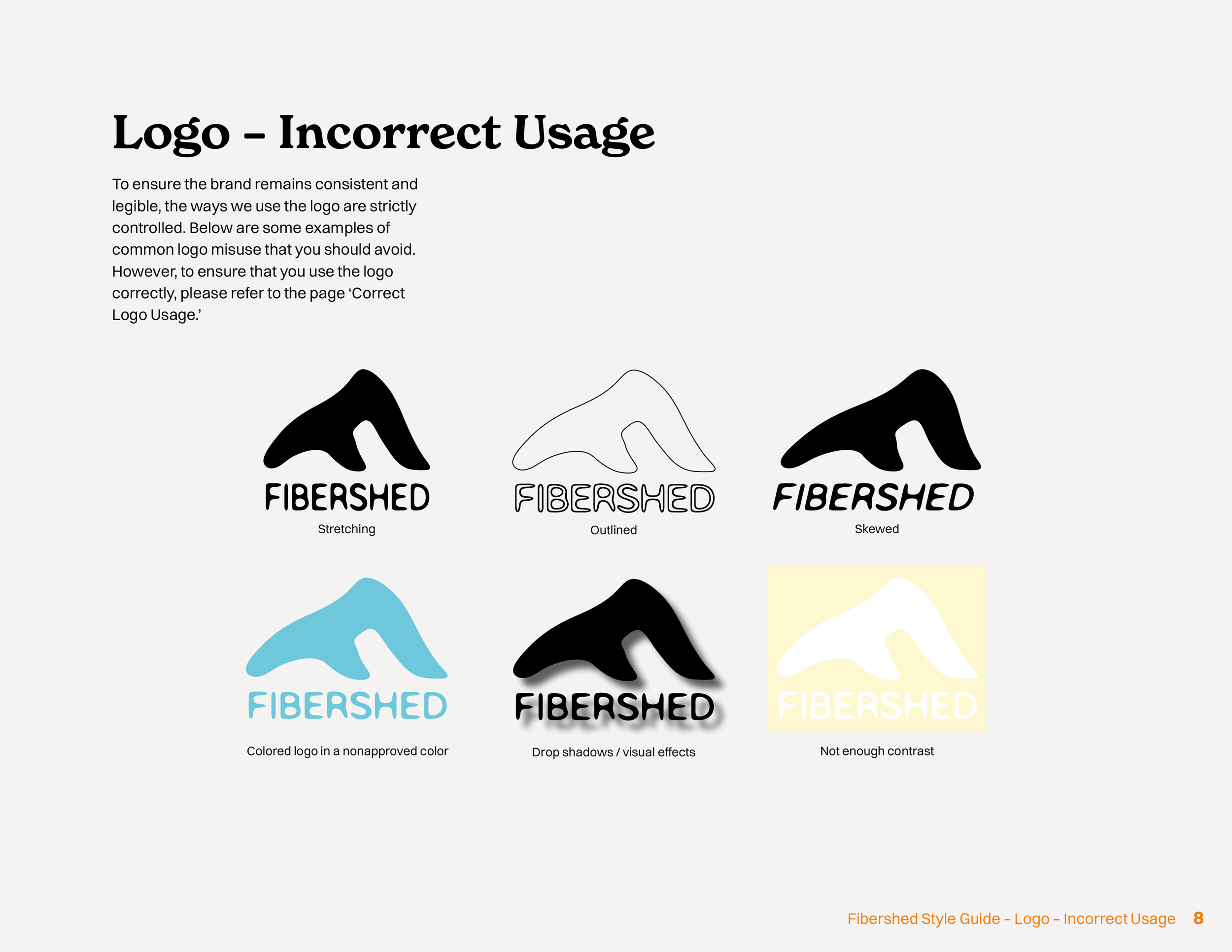
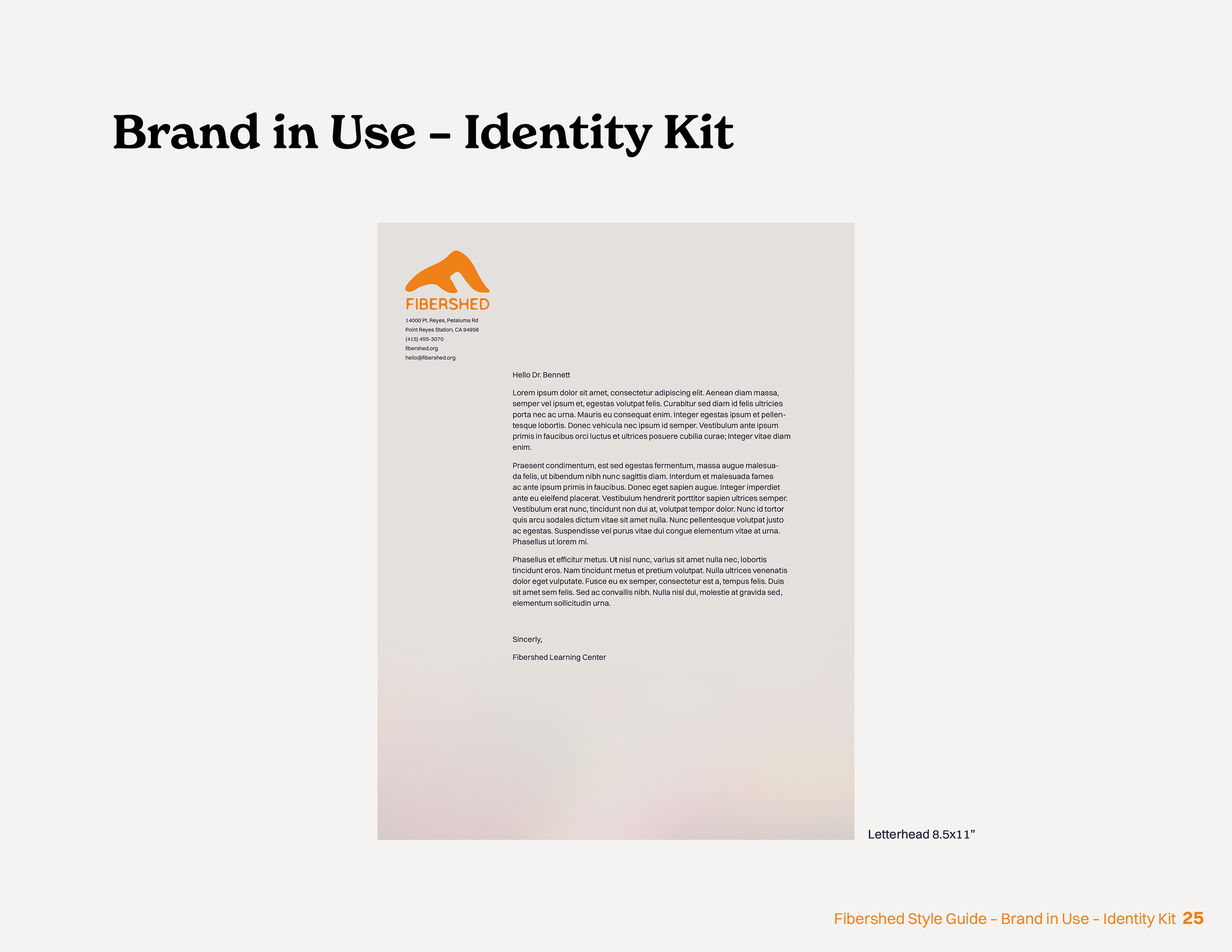
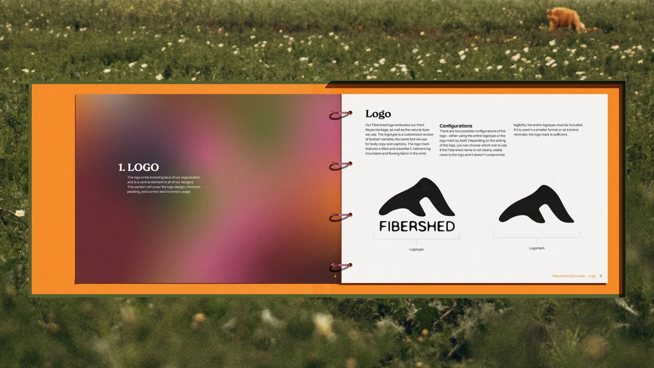
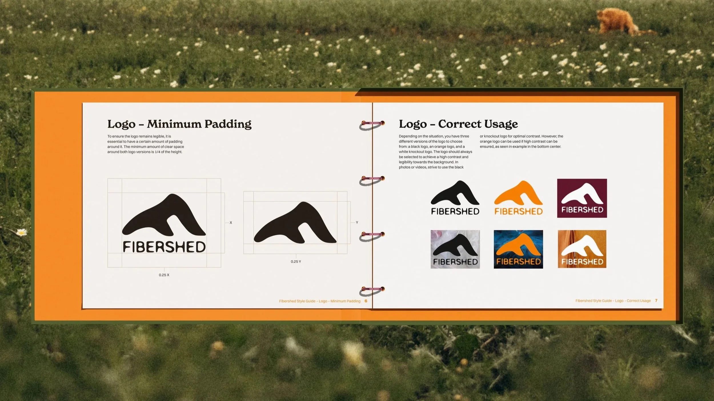
The logo merges Point Reyes’ windy hills, fabric flowing in the wind, and an F. After multiple iterations, we landed on this design because it was the most representative, legible, and memorable version.
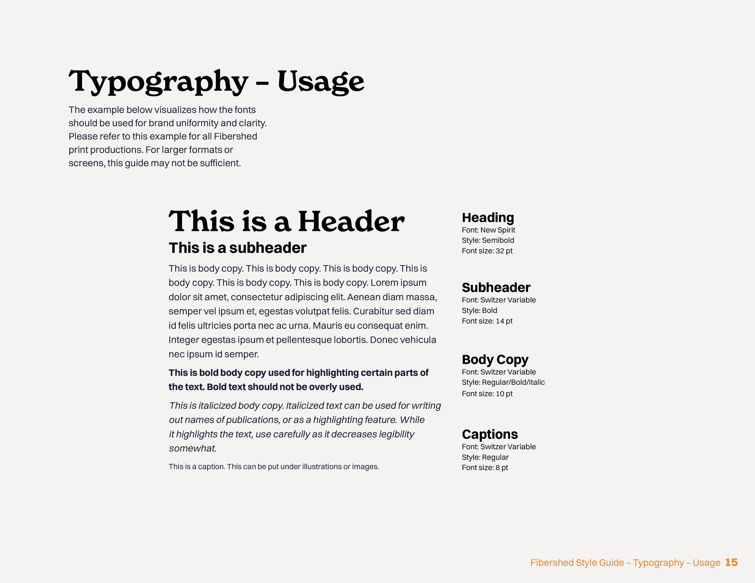
The softness is further carried into the typography, which pairs a soft and traditional style serif with rounded edges and asymmetric counters and stems for titles and headers, and a more geometric font with even stems for body copy. It creates an organic impression while still being an easily scalable font for different purposes.
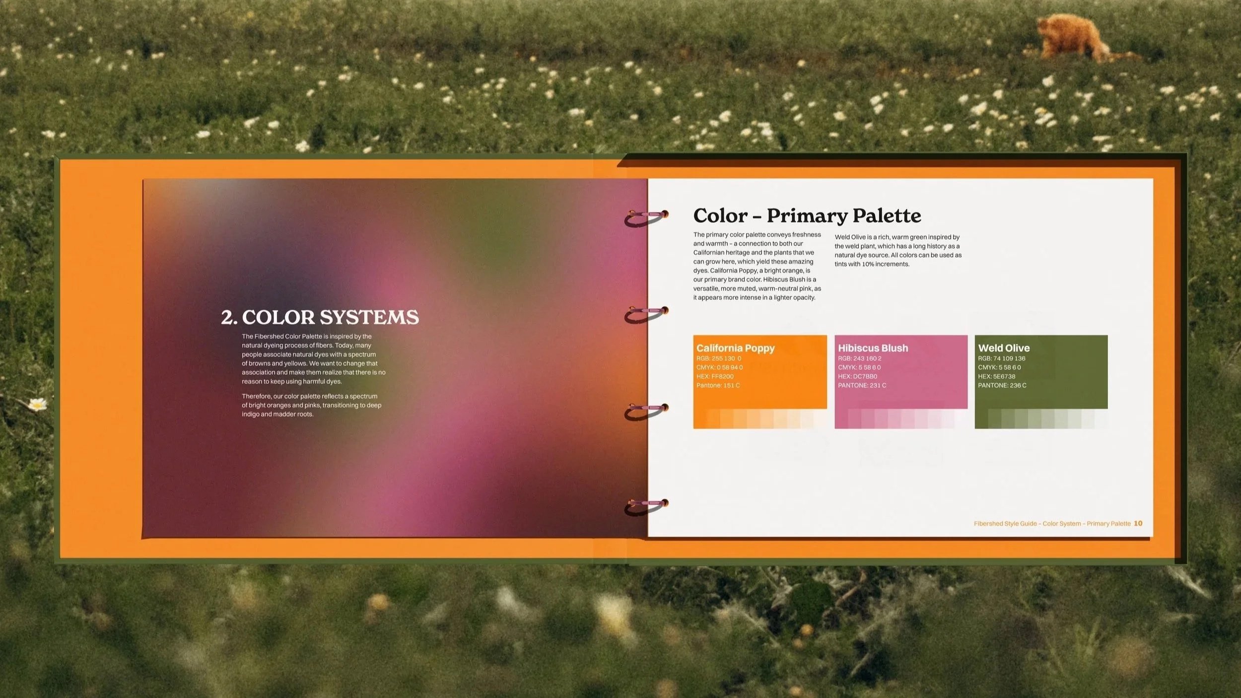
Colorwise, I really took a deep dive into California native flowers and plants. The color palette reflects the variety and potential of local resources. The stars of the palette are California Poppy, Hibiscus Blush, and Weld Olive. However, for most Californians, I think the California Poppy is the most identifiable, as it is seen so widely in the state. The more neutral colors are inspired by and named after either pigments or other plants used in the process of textile production, such as Walnut Husk and Alum Bath.

The Brand Guide
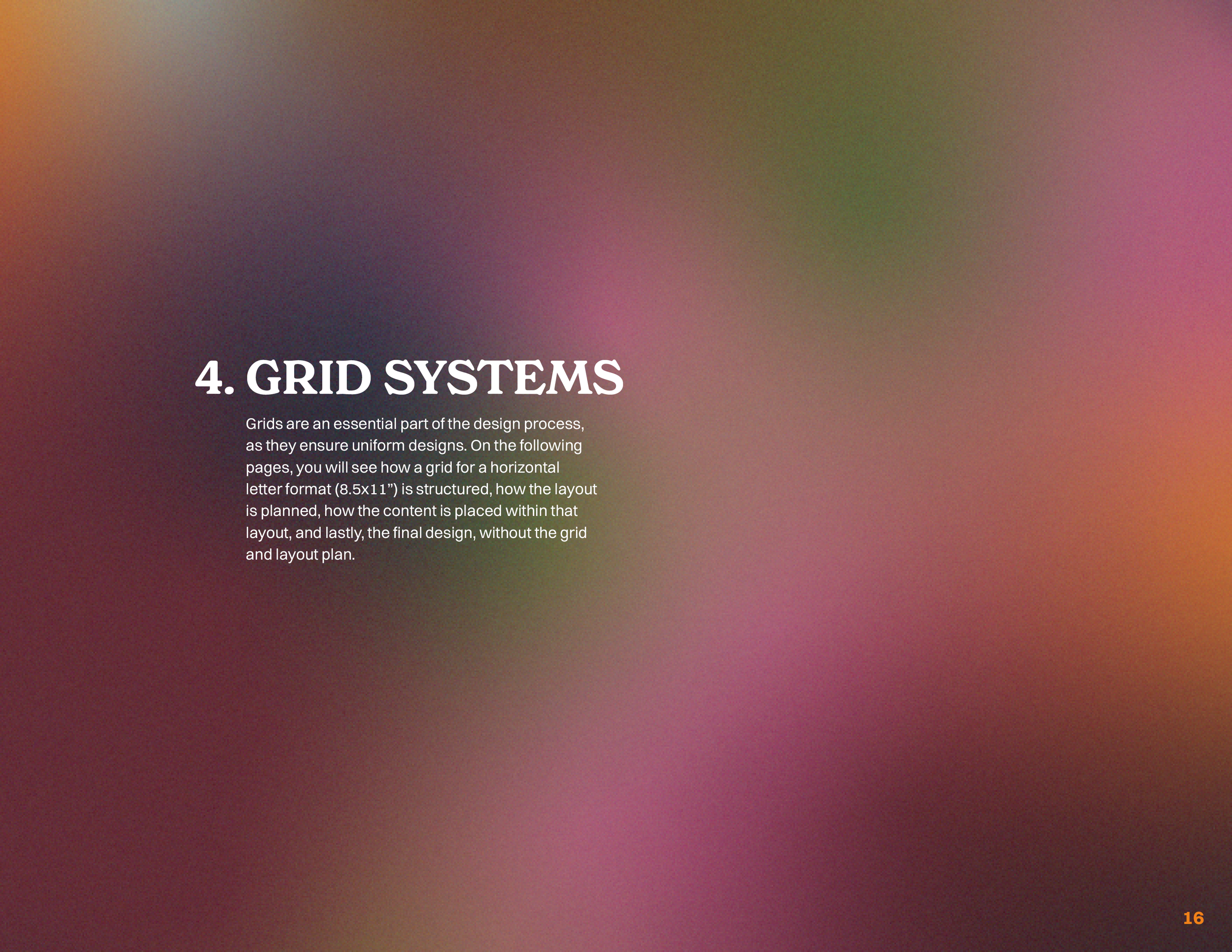
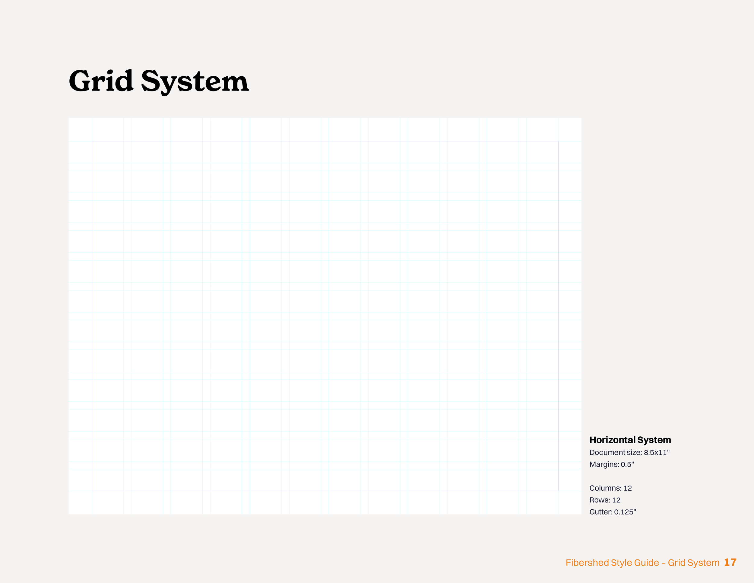
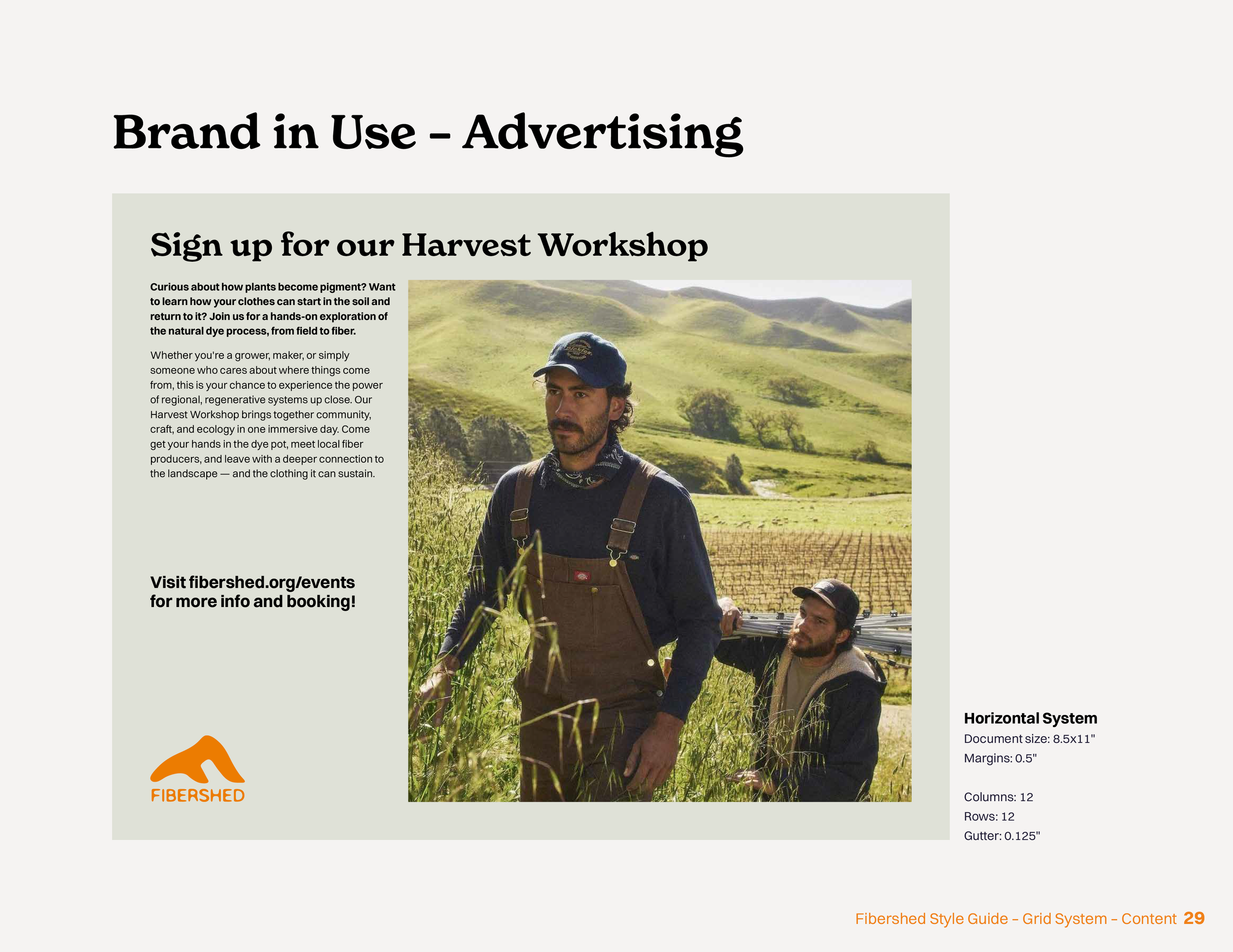
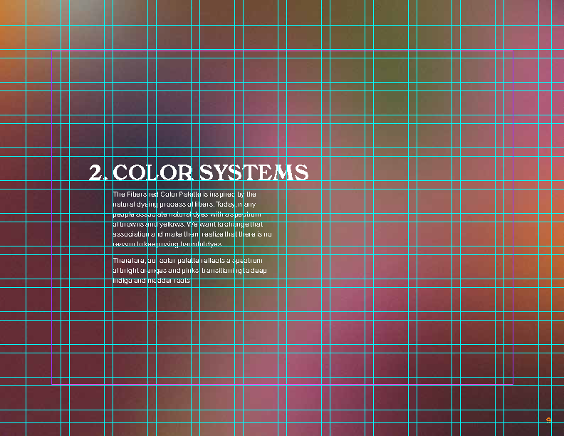
Putting together the brand guide, I used a 1” margin with a 12x12 grid, with a variation of five layouts. This ensured enough variety while feeling cohesive throughout. Above, you can see two of the layouts based on the grid. Below, you can see the brand Guide in it’s entirety.