


Visual Identity
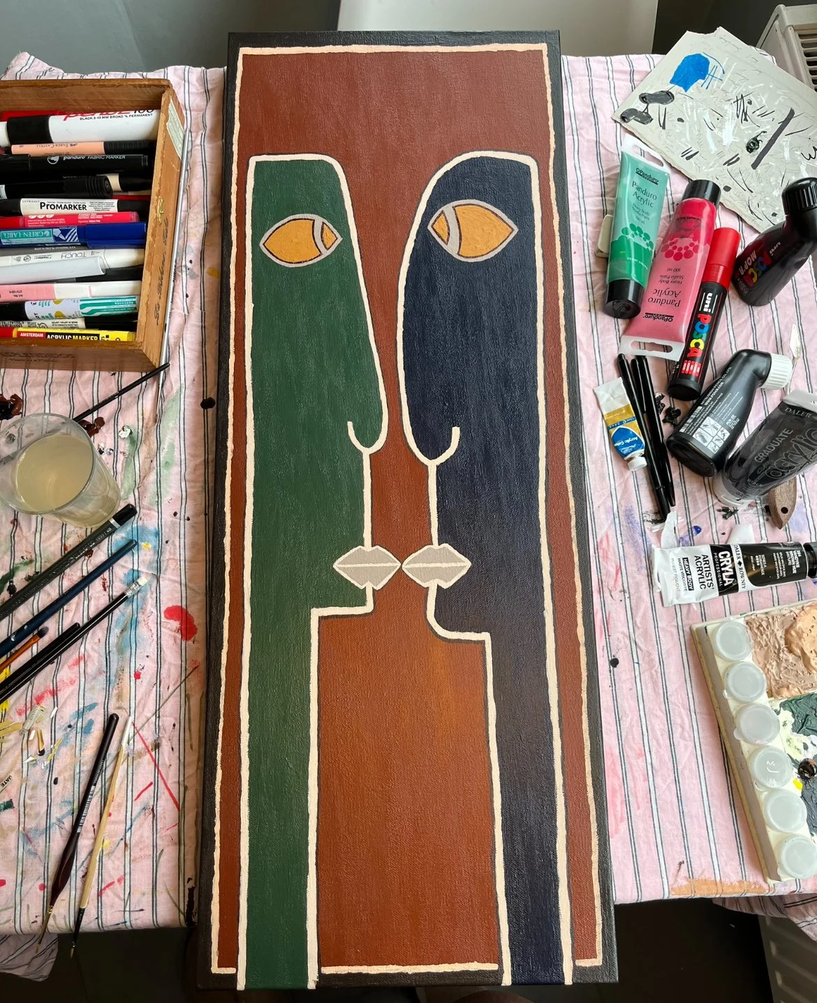
Aftonglans is an alias and art project by a Swedish artist who creates bold and abstract acrylic paintings. Aftonglans is a Swedish term used by Swedish poet Vilhelm Ekelund, and it translates to evening shine or moonlight. With the goal of taking it from just sharing art pieces and inspiration online, the client wanted to build an intentional and scalable brand.
Inspired by 90’s New York and underground scenes, the final branding system bridges a professional and rough, handmade expression that truly reflects the soul of the artist’s work and philosophy. Imperfections and roughness are recurring throughout, but with repetition and intention.
Visual identity
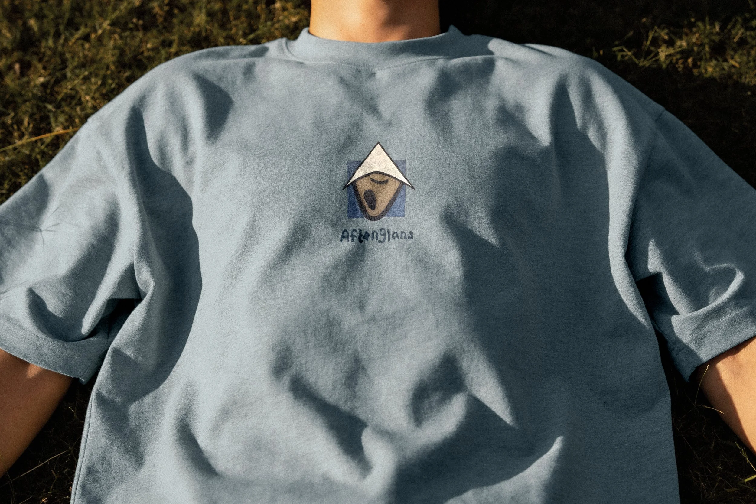
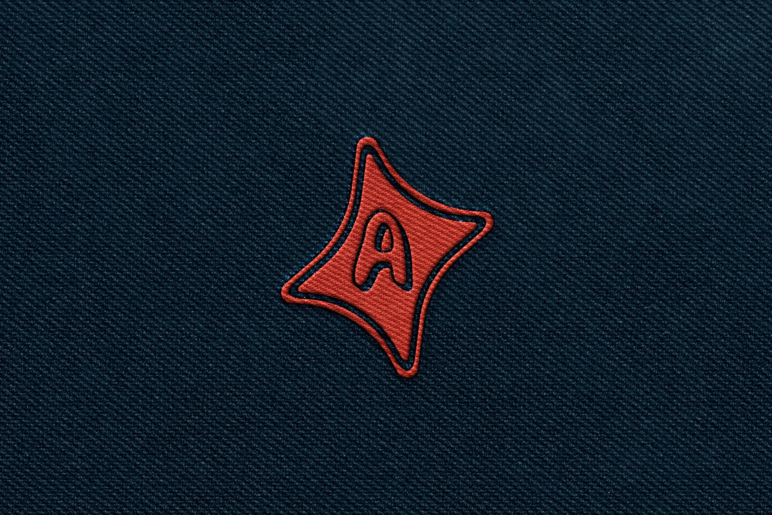
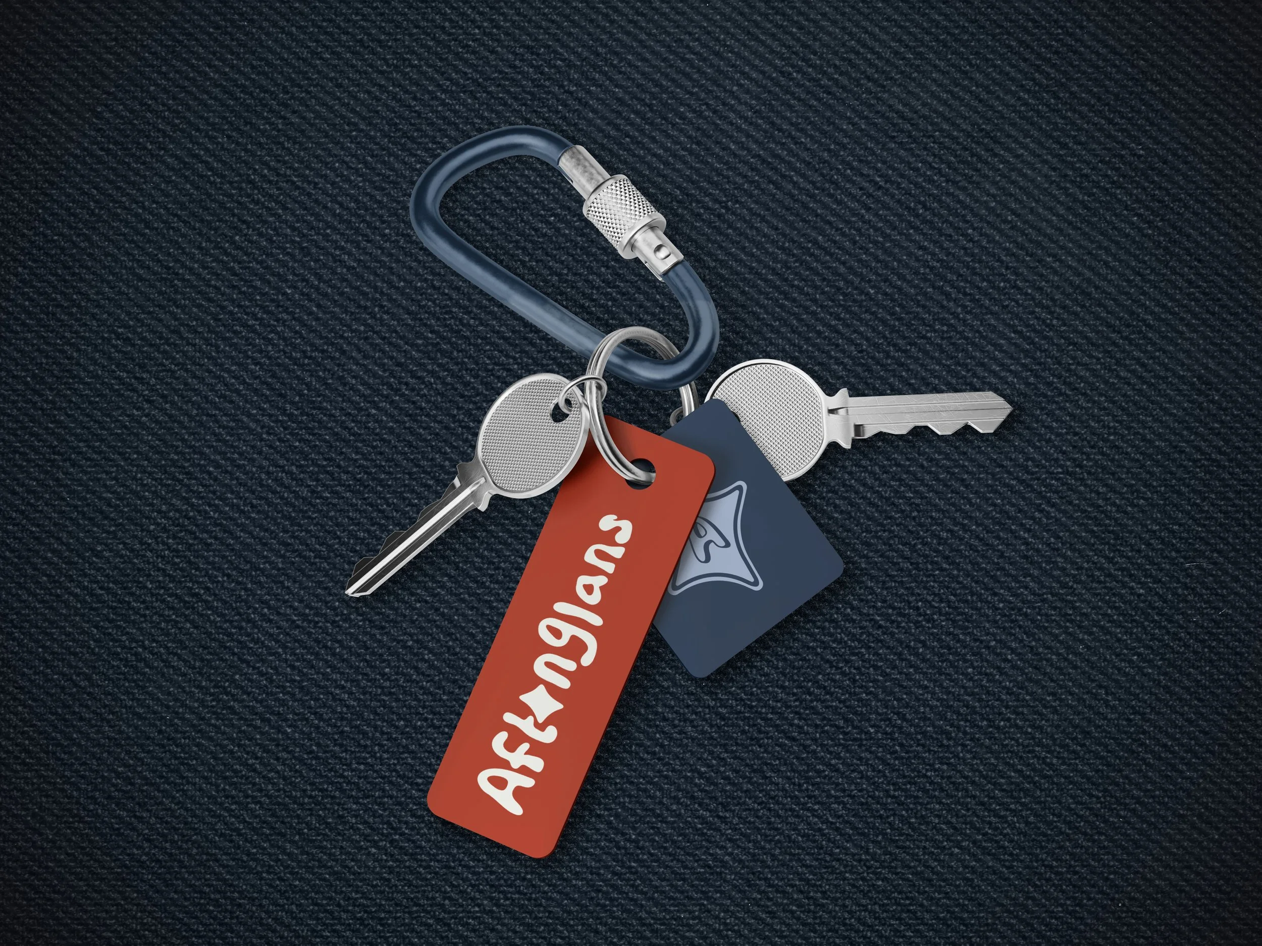
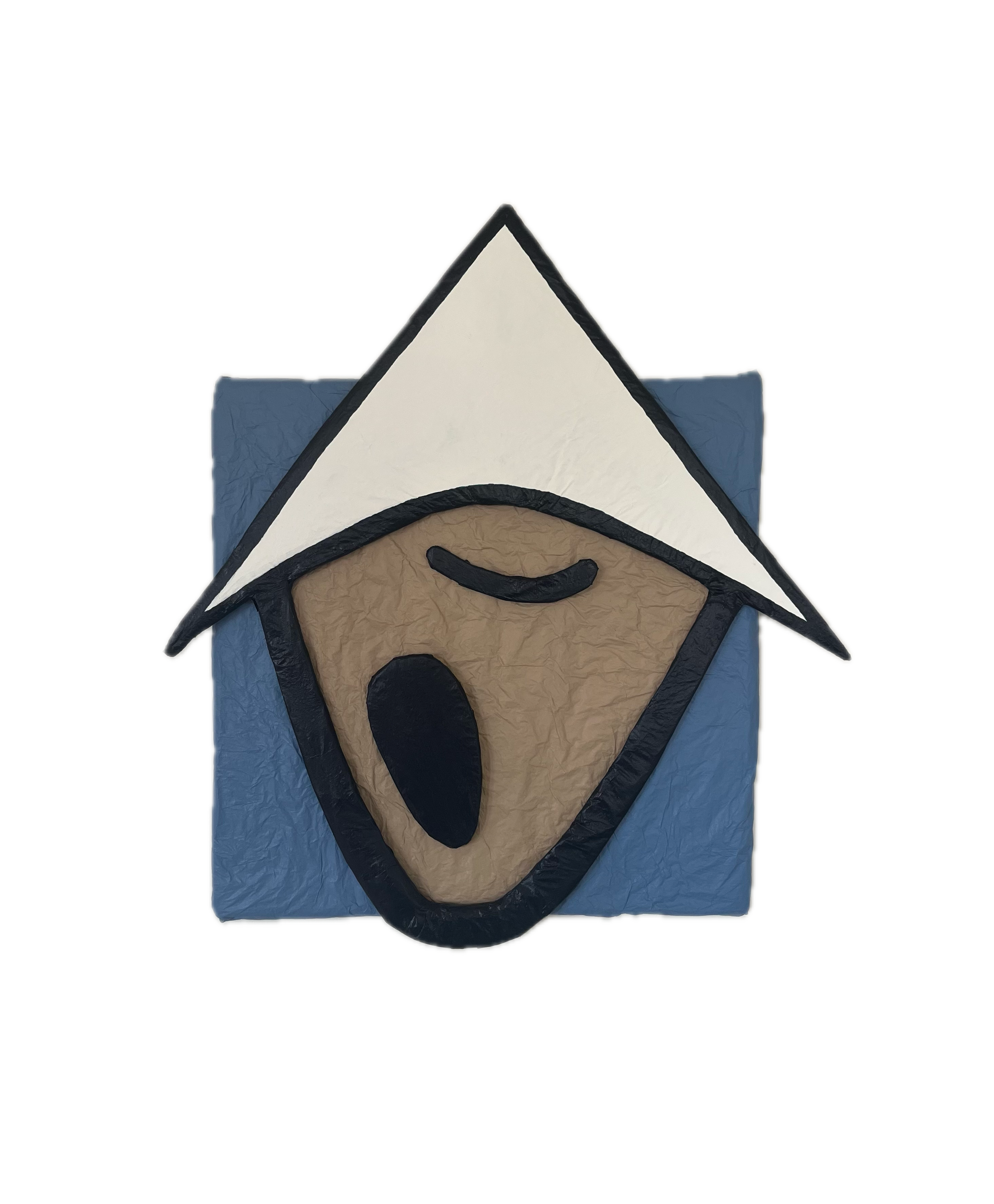
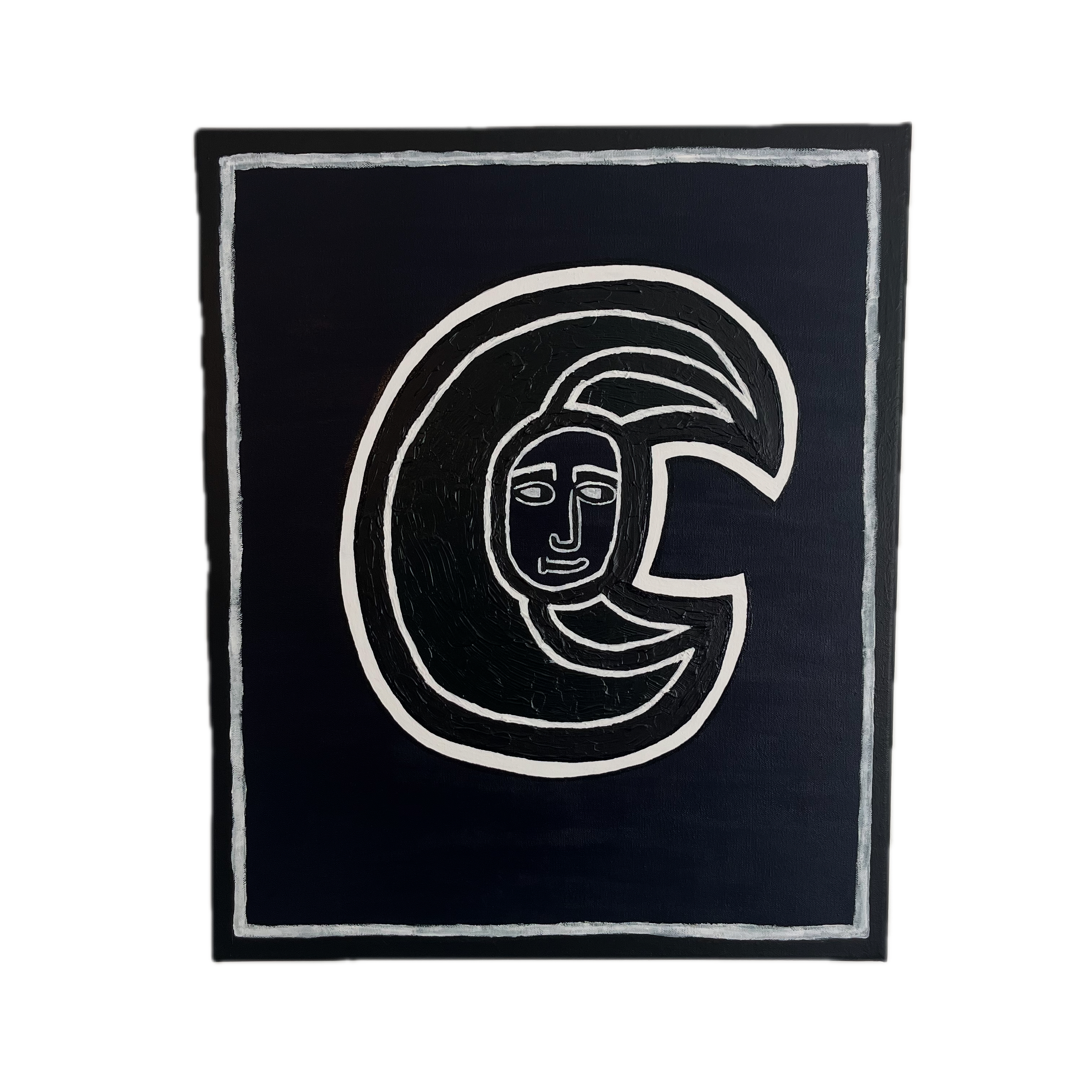
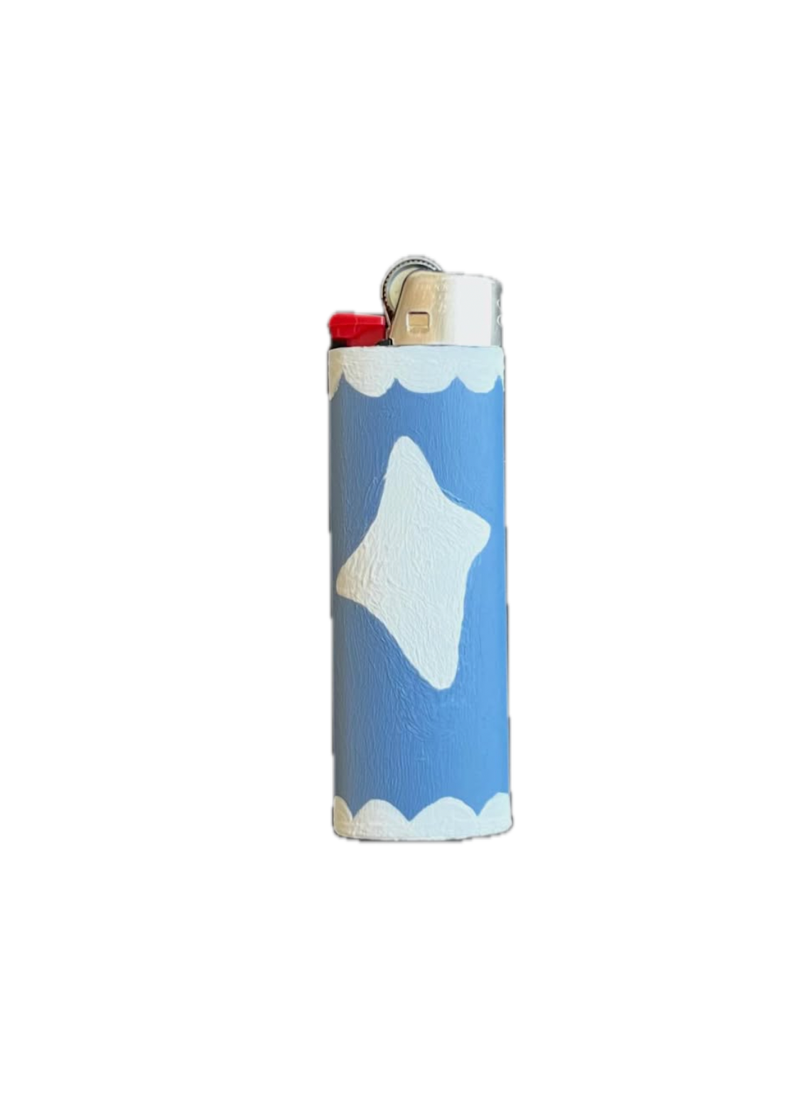
The logo suite is made up of a primary logo, a secondary logo, and a brandmark. The primary logo is a hand-drawn logotype with varying letter heights, optically aligned to the center line. It has uneven strokes and a stylized o, a visual nod to a sun beam hitting the water at sunset. The secondary logo uses the same foundation as the primary logo, but the letters are warped into a circle. The brandmark acts like both an icon and a sticker design for the artist’s shipping kit. The overall expression is soft and wobbly, but intentional.
The brand colors are medium-deep, muted, and earthy—inspired by the gritty urban 90’s and hot summer nights.
The typefaces are two playful sans serifs. Both have a handcrafted quality, with imperfections such as uneven and asymmetrical weights and strokes.