

Visual Identity & Web Design
NACA is a conceptual organization that bridges Nordic and American cultures. For this project, the organization needed a logo that reflected their cultural roots while having a modern and approachable expression. They also needed a brochure for a series on teaching Americans about Nordic traditions—in this case, Swedish midsummer.
The logo is an eye-catching visual that draws on Norse mythology's references to knowledge. The trifold die-cut brochure is covered in summery illustrations, also rooted in Swedish folk art traditions, and together they tell a story about one of Sweden’s most loved holidays.
the logo
Growing up on Helgö — one of the Viking Age's earliest trading islands in Lake Mälaren — history was never something you visited; it was just there. We sledded on burial mounds, used runic script as a secret language, and grew up with the Edda stories in their original strangeness — long before Norse mythology became Marvel or a political symbol. That unselfconscious closeness to something ancient, without it ever feeling like a museum or an ideology, is what this project draws from.
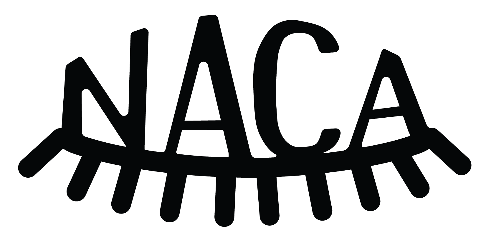
The logo's visual anchor is Odin's eye — symbol of a god who hung himself from the world tree for nine days and sacrificed an eye at the well of wisdom, all in pursuit of knowledge. The NACA acronym forms the shape of the missing eye, making the organization itself part of the myth. It positions NACA as both a guardian of tradition and a living source of cultural wisdom.
Airplane view over the old viking headquarters of Helgö, Birka and Adelsö.
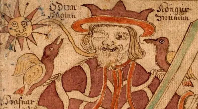
How the one-eyed Odin is depicted in historic illustrations
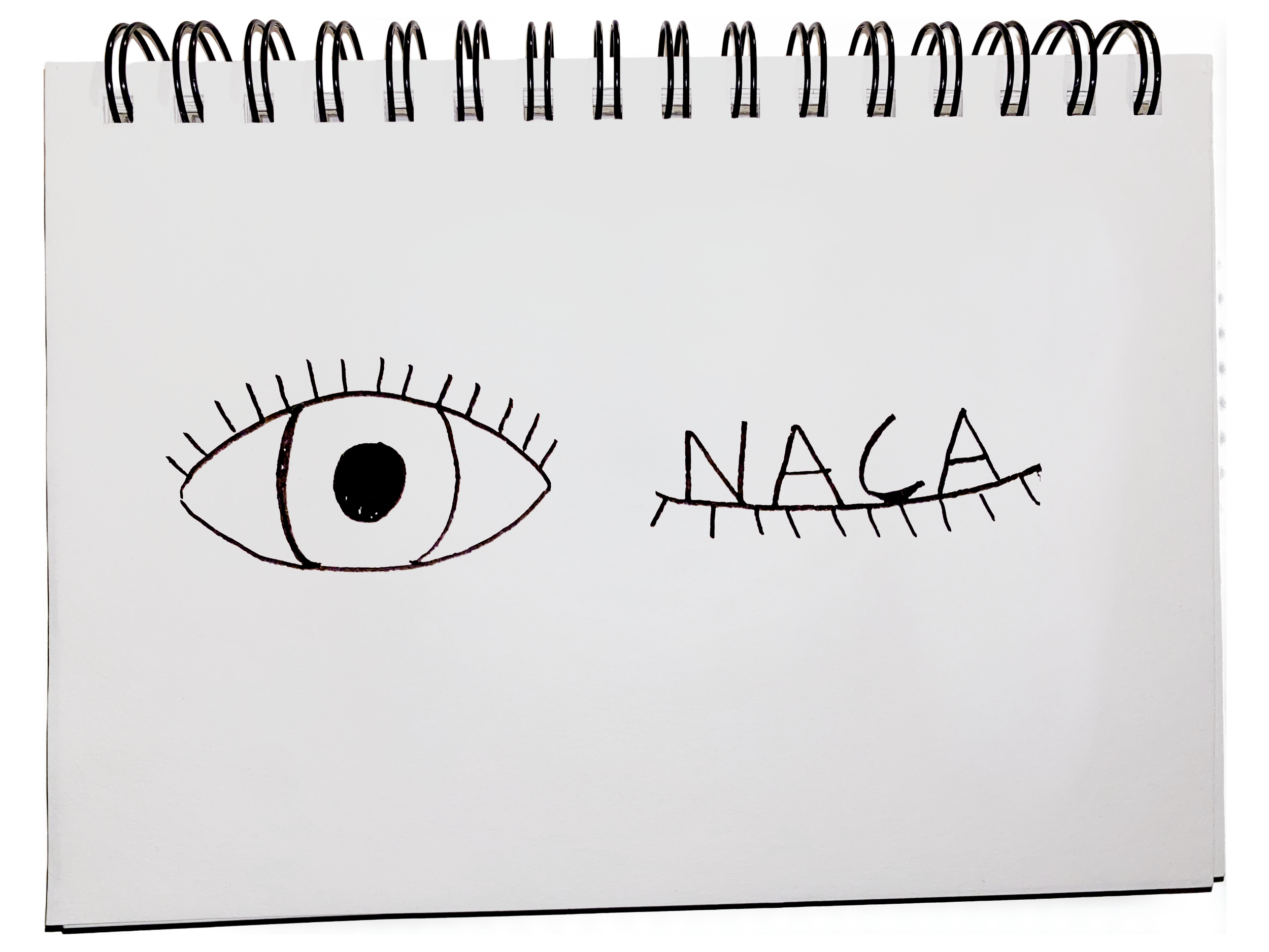
Thumbnails of the logo during the research process
Final logo for NACA
the brochure
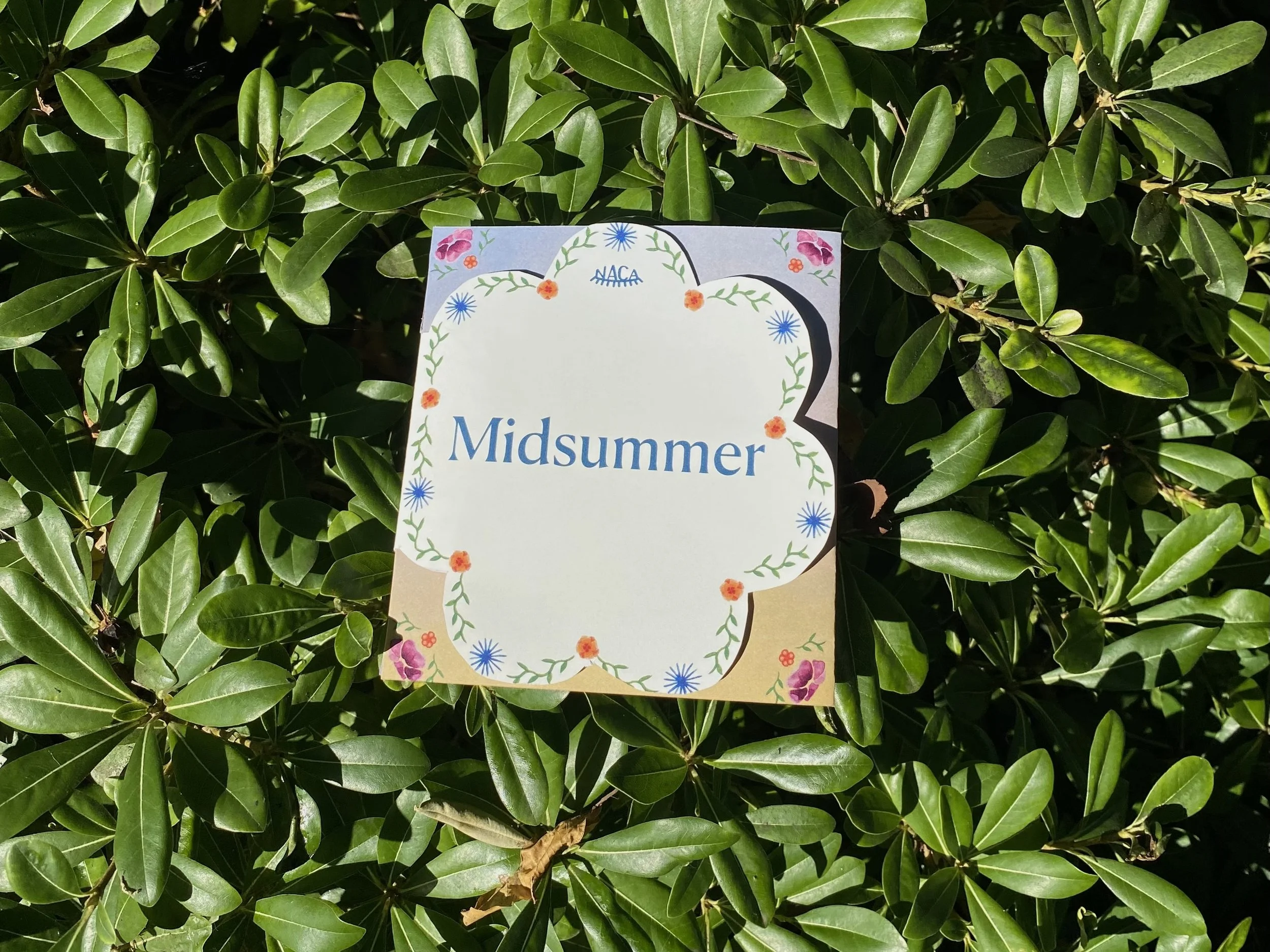
The tri-fold educational brochure introduces the Swedish Midsummer celebration while demonstrating how the visual identity works in application. The die-cut cover element creates a memorable tactile impact and references traditional flower crowns, while hand-painted Midsummer scenes show the narrative potential of the illustration style. Generous negative space and an illustrated-book aesthetic ensure that visual elements enhance rather than overwhelm educational content, and the typography system proves its versatility across the informational hierarchy.
The entire brochure is painted by hand in gouache and digitally edited before printing. All settings reflects traditional Swedish settings and landscapes during the summer midnight sun.