Mahler’s
symphony No. 1
transitional typographic system poster
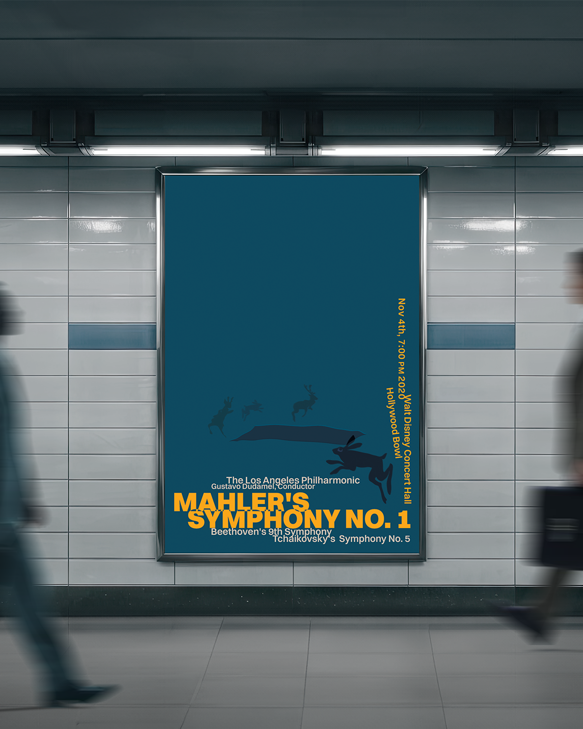
The goal for this project was to create a classical concert poster for a concert by the Los Angeles Philharmonic playing Mahler’s Symphony No. 1 (headline), Beethoven’s 9th Symphony, and Tchaikovsky’s Symphony No. 5. The poster was supposed to feel modern and eye-catching, while utilizing the idea of typographical systems.
Research
In preparation for this project, I listened to all the symphonies, but mainly Mahler’s Symphony No. 1, many times, while I began creating layout thumbnails and brainstorming a color palette and symbols. This helped me elicit an emotional and creative response to the piece before diving into the objective reference materials and sources written about it.
The symphony is inspired by different stories or references to children’s songs like Frére Jacques (Brother John), which is played at the beginning of the fourth movement. Mahler disclosed the European folklore and story of the Huntsman’s funeral, especially the woodcut called “The Hunter’s funeral procession.” Both references inspired my design and were a great way to steer away from generic classical music motifs.
About Typographic Systems
For this project, I read Typographic Systems (2007) by Kimberly Elam. Elam covers eight typographic systems that create interest and tension, and also describes how they guide the viewer through the design. While all system creates interest, it’s not said that all of them are as legible as the next one. For example, in the random system, which, from a readability standpoint, is truly radical, the letters work more like a texture or visual design element, rather than a reading component.
That said, some of the systems were not well-suited for a promotional poster, as they need to catch the viewers’ attention in an instant. The transitional system caught my eye as it can still be very legible, while still creating tension and movement. In the basic variations of the transitional system, the lines are typically parallel in one direction, resulting in all lines being either horizontal or vertical. However, there is a variation where the repetition is interrupted by breaking the lines, like in this example, inserting vertical lines in a primarily horizontal line composition. Elam phrases this composition as if “the eye comes to a screeching halt where horizontal and vertical type meet.”
Also, by placing the type design at the edges, it creates an almost uncomfortable amount of negative space. It pushes the viewers’ attention to the bottom and bottom-right edge of the page, breaking western reading norms. This type of composition demands attention.
Outcome
The outcome was a poster that signals the late-night setting of the story that inspired Mahler to write the symphony. The warm, orange-yellow symbolizes the start of the sun rising.
The illustration is subtle and almost blends in with the background, and it shows up as a memory or a recognition of the origin, rather than writing the viewer on the nose. The illustration is heavily inspired by the woodcut, in order to make that connection clear.
The visual hierarchy is fairly apparent in this design, as it relies on font size, placement, and contrast in color and weight.


