Fibershed
the future of textile production

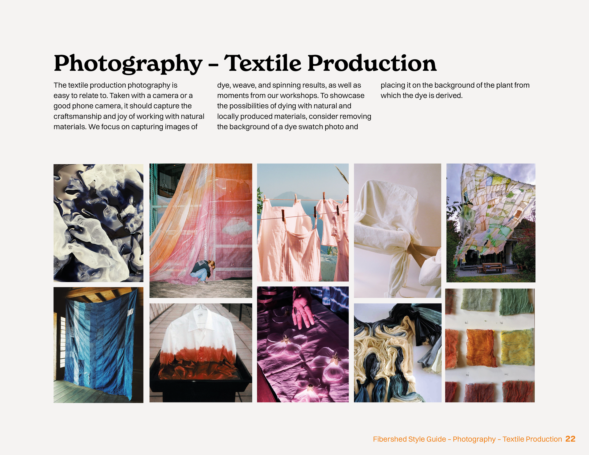
Fibershed is a NorCal-based nonprofit working for sustainable textile production. They educate textile businesses on agricultural methods on how to produce fibers as well as dyeing techniques using locally sourced and grown resources. In this rebrand, the possibilities of using natural materials shine. The natural choice should be the only choice.
Client
Fibershed (Conceptual)
Designer
Nora Lundberg
Year
2025
Service Provided
Brand Design, Branding Style Guide, Stationary Kit
The Logo
The logo showcases a tilted and modified F that evokes the image of two mountain tops, emphasizing their connection to Point Reyes. The text draws inspiration from dye bleed, adding to the dynamic feel. In the initial vectorized iterations, the logo appeared either very abstract or sharp. Given Fibershed’s commitment to sustainability and nature, I focused on designing a softer, more organic shape that truly reflects those values.


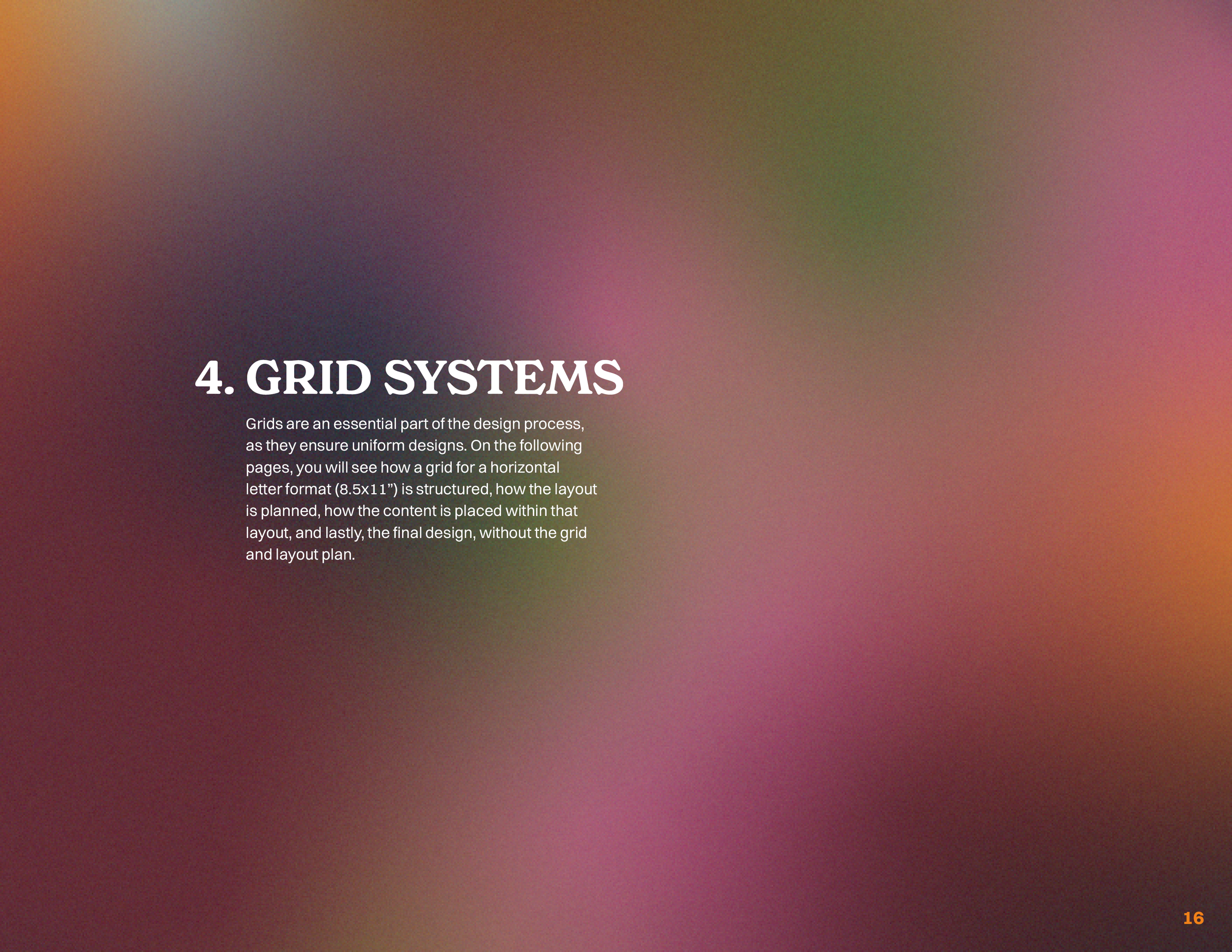
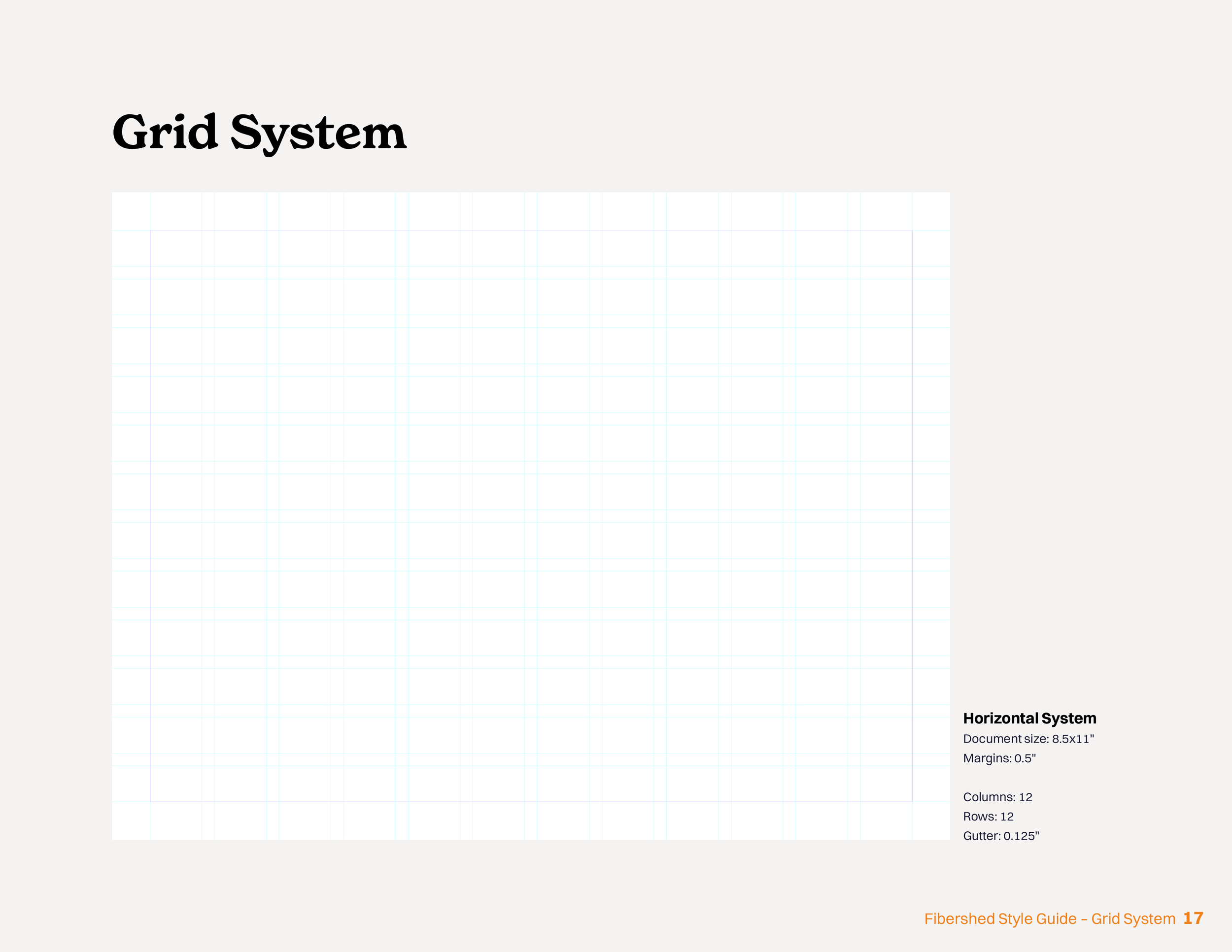
Grid Systems
I used a 1” margin with a 12x12 grid. This grid made it possible to ensure maximum versatility without risking that those elements would jump around on different pages depending on the page layout. My goal for the layout was to make it feel easy to read and avoid being an experimental design element, as the text is an instruction that the user must follow. The entire 30-page document includes five layout options, but the two shown in this image are the two foundational layouts.


Outcome
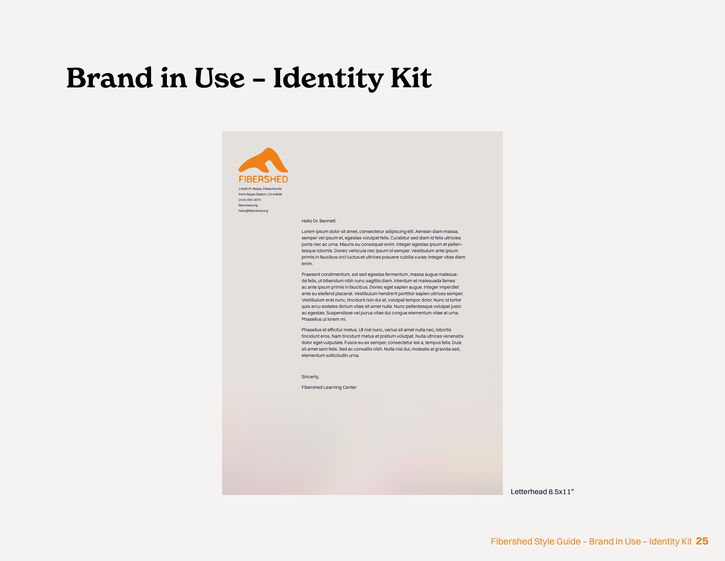
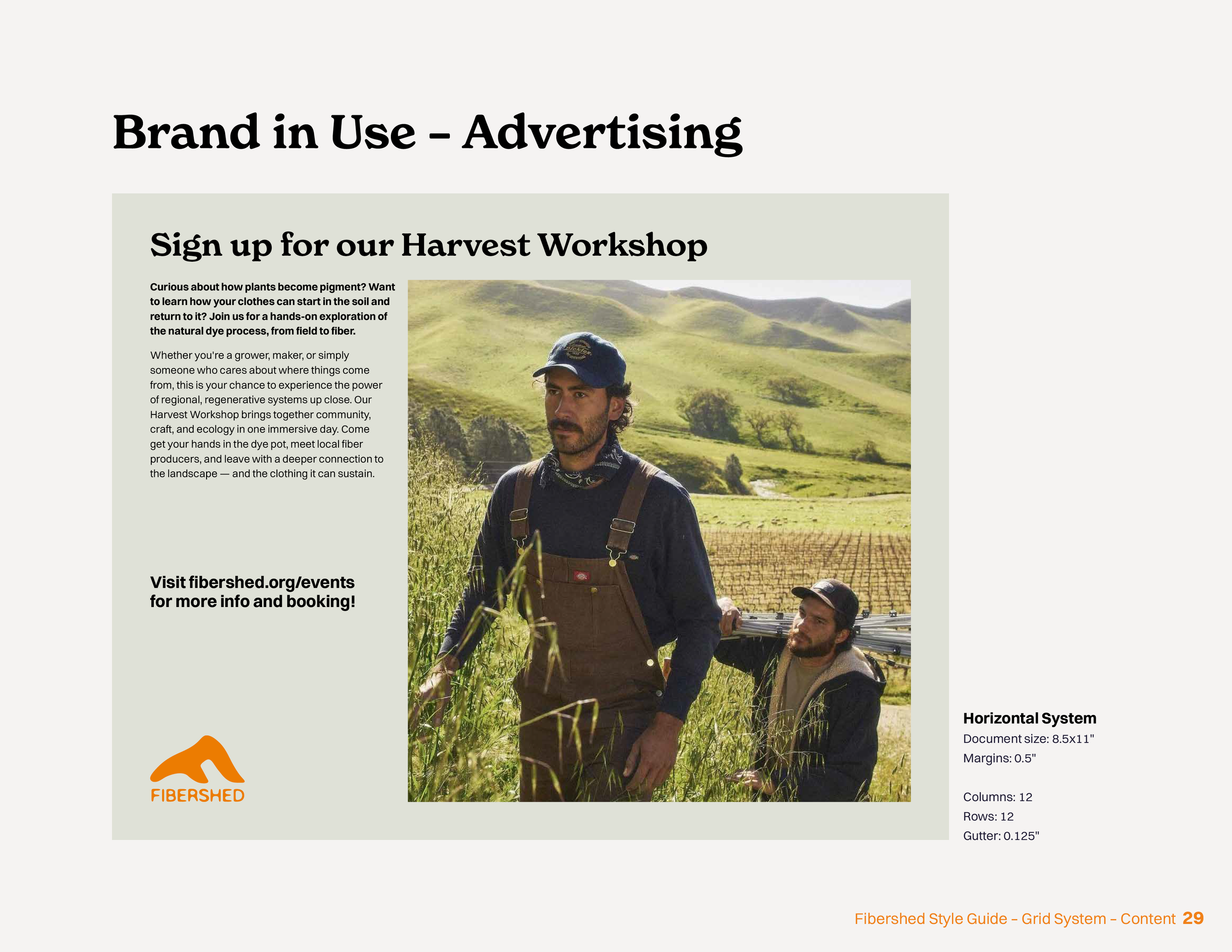
The outcome was a cohesive 30-page style guide that guides designers in maintaining the right brand voice while designing. The guide demonstrates how to create highly curated materials, as well as the everyday documentation and marketing that is frequently updated on their website and social media, for example. Everything – from the logo and color to typography and imagery - communicates a fresh take on a very bohemian visual culture.
Click-through style guide (desktop optimized)