
Knitty Gritty Fest
making knitting vibrant
Knitty Gritty Fest is a knitting community event for knitters and fiber artists in San Francisco. They are set on changing the perception of knitting from dull to vibrant and creative. For this project, branding and collateral were designed, as well as an advertising poster for the 2025 event.
Client
Knitty Gritty Fest (Conceptual)
Designer
Nora Lundberg
Year
2024
Service Provided
Brand Design, Event Poster, Collateral
Research
The research for this project included a competitor analysis of other fiber art businesses through visual research. Many knitting events, yarn brands, and other related entities maintain a minimalist and cute visual language, incorporating symbols like sheep, swirly yarn lettering, and soft pastel colors. This research was gathered and explored through several different moodboards before landing on this one.
After composing the moodboard, I started working on thumbnails, exploring both solutions for the logo and the poster composition. Because my color palette and tone would already deviate from the most commonly used knitting aesthetic, I wanted to create a spin on more conventional symbols and subjects within the fiber art community, such as knitted items, knitting pattern charts, needles, sheep, and so on. Below is an excerpt from the thumbnailing and ideation process.

Thumbnails for logo and brand illustrarions

Thumbnails for logo

Thumbnails for poster composition

Poster composition ideation
Designing the logo
The logo features knitting stitches in its outlines, following the stitch pattern typically used for knitting the logo onto fabrics. This pattern is a strong symbol for the fiber art community, pointing toward knitting, for example, rather than crochet or weaving. It also allows for a fully spelled-out name, without losing the character or essence of the logo.
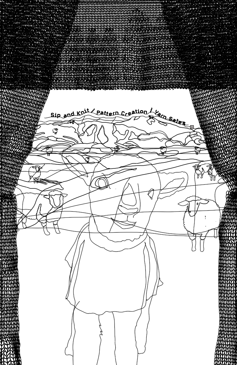
Designing the poster
In the first draft of the poster design, I created a nighttime scene featuring a lamb and two sheep at the center of the composition, positioned at the bottom. The knitted curtains that frame the composition do not follow the top or bottom edge. After creating the first draft, I had a round of feedback, where I mainly got positive comments; however, the reviewers were a bit hesitant towards the moody setting and how small the lamb in the front was. I decided to add more vibrancy, make the lamb more of a hero in the composition, and continue with the original plan of creating the knitted curtain at the top to create the actual logotype and knitted effect. Although the moodiness brings out an edge, the warmer color palette is more inviting and eye-catching, if seen from a distance, which is often the case for advertising posters.


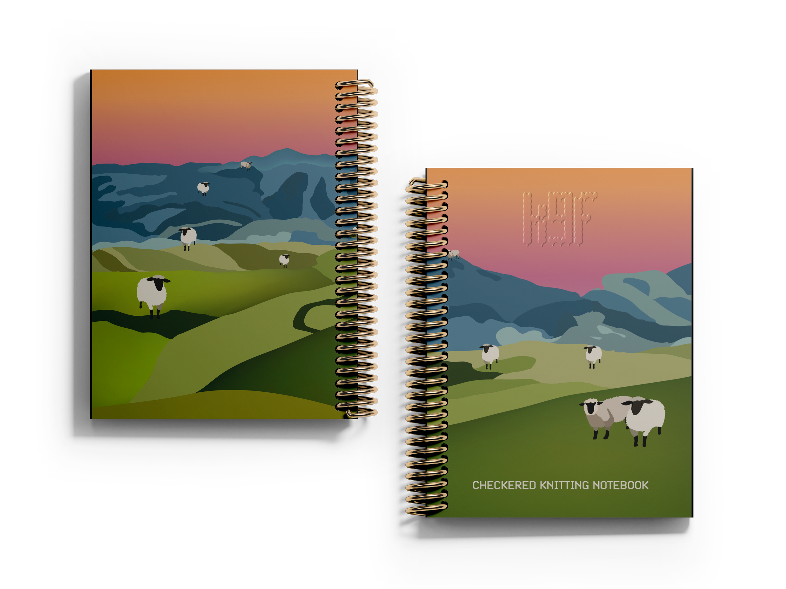
Designing the merch
The ticket and merch are knitting-specific and reference the elements from the logo and poster throughout. The merchandise includes a knitting project bag, used for storing your current knitting project on the go, a knitting notebook for taking notes on customizing patterns or creating your own designs, and an enamel mug that you can use for your favourite drink while doing your favourite craft. The ticket features a tear-off style, allowing you to keep the non-barcode part as a bookmark or scrapbooking piece.


Reflection
This project reframes knitting from a dull, old-fashioned activity into something vibrant and expressive. Visual research helped me see how fiber art and knitting communities often lean on muted palettes, swirly type, and minimalist layouts. I found the design worked best when breaking only one stereotype—keeping the lamb as an anchor while contrasting it with vibrant colors, clear typography, and a strong hierarchy.
Instead of clichés like the Golden Gate Bridge, I drew from San Francisco’s surrounding mountains and hills—imagery that resonates more with locals than tourists. The entire piece was digitally illustrated by hand, which made it more time-consuming. If redone, I’d simplify by creating details like the knitted curtain pattern in larger construction.


